Lily Barbrook
Employment
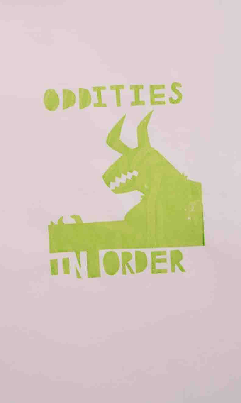
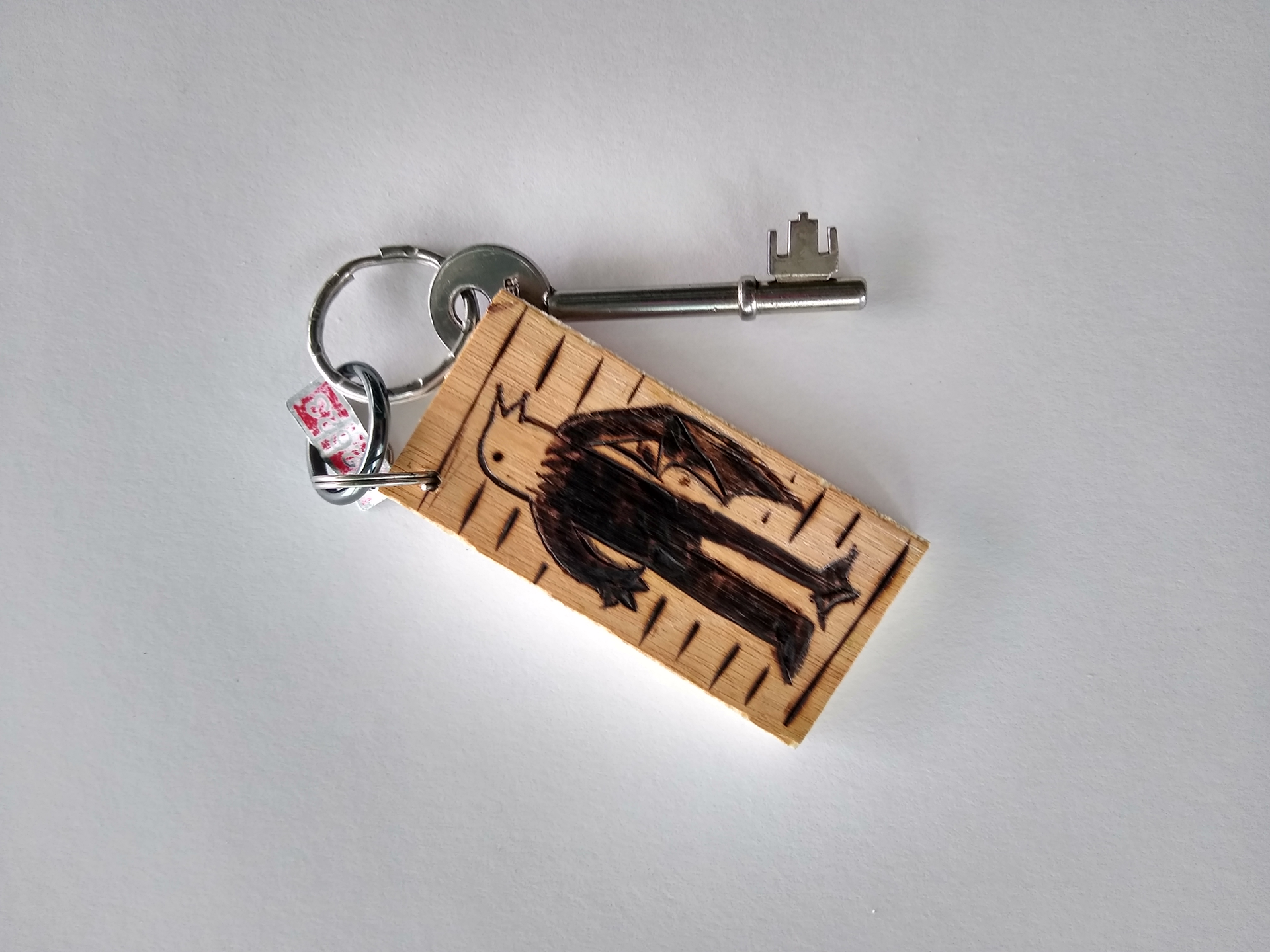
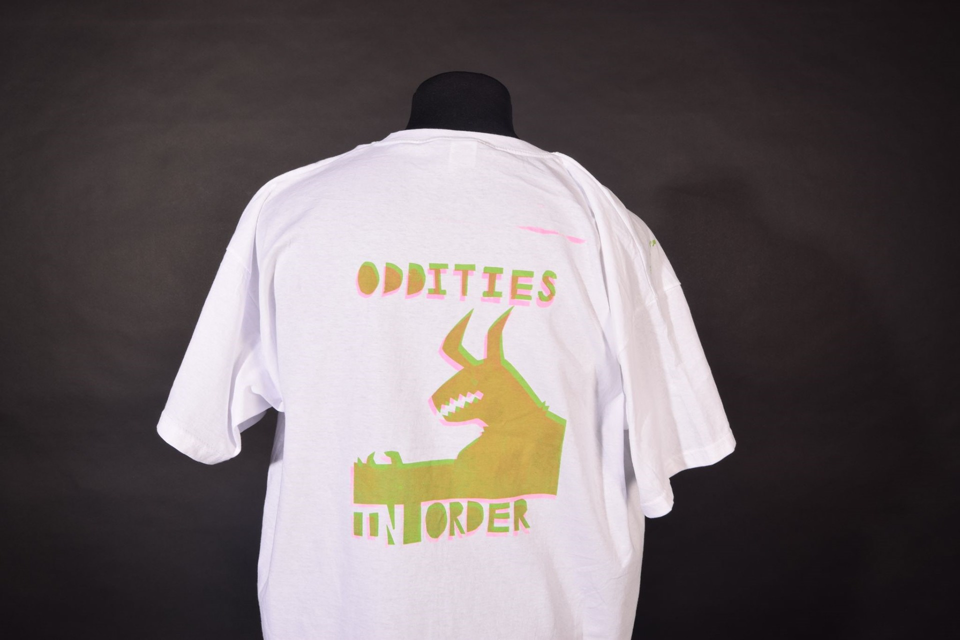
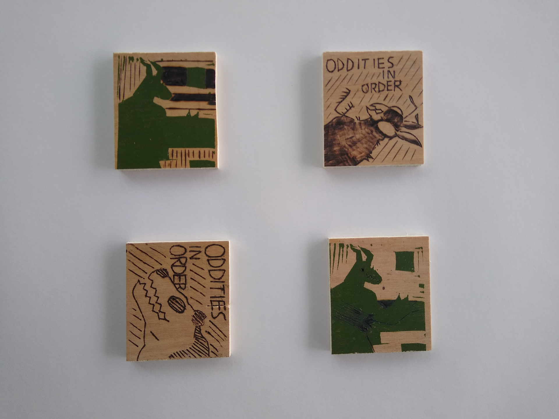
Oddities in Order
For my fmp i wanted to look at something to do with the way you present something to someone and how that changes their perception of it, originally i went into this with the perspective of”oh remember when they would just lie and make up fake creatures for entertainment, that was funny” and that then in turn led me to look at click baiting fake or “hoax” creatures, then to taxidermy and then to exhibitions and collections. I finally ended up producing promotional materials for a museum displaying an exhibition of “rare animals” which were in fact hoax creatures i had designed with help from my peers
Florey Bone
Employment
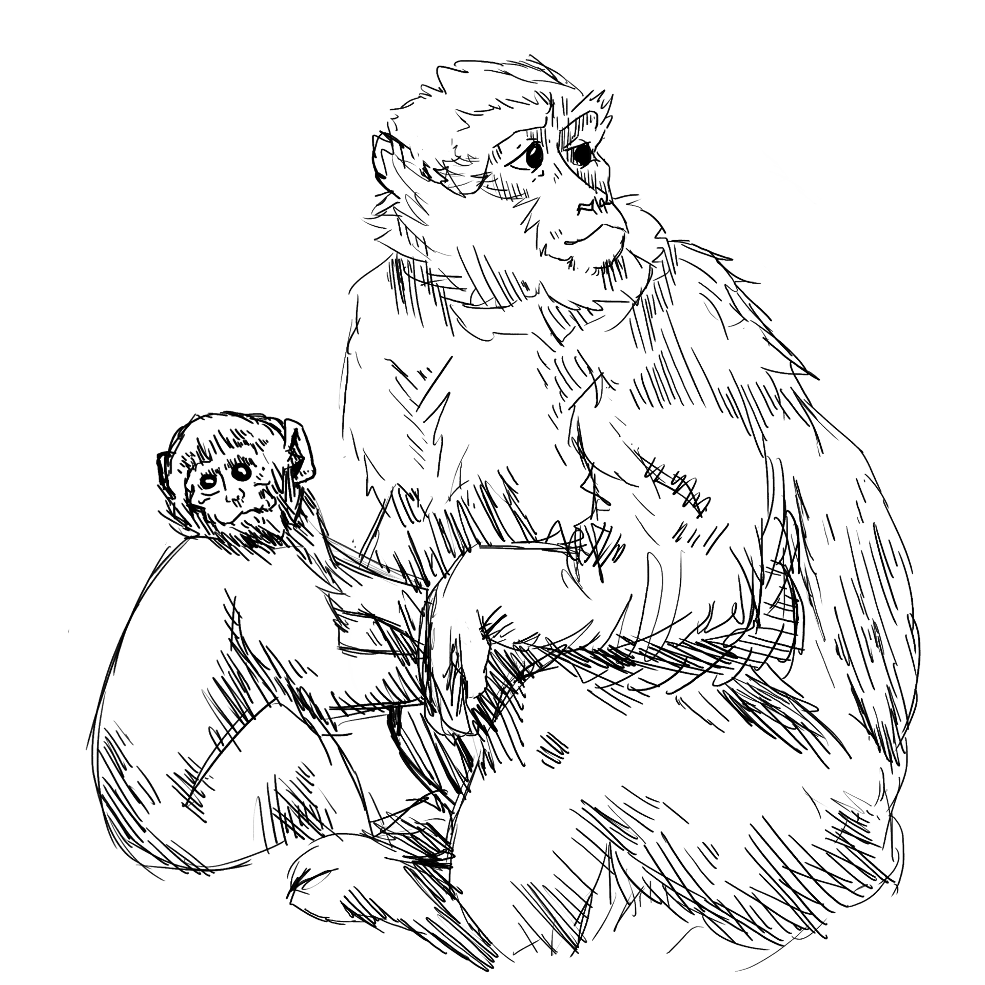
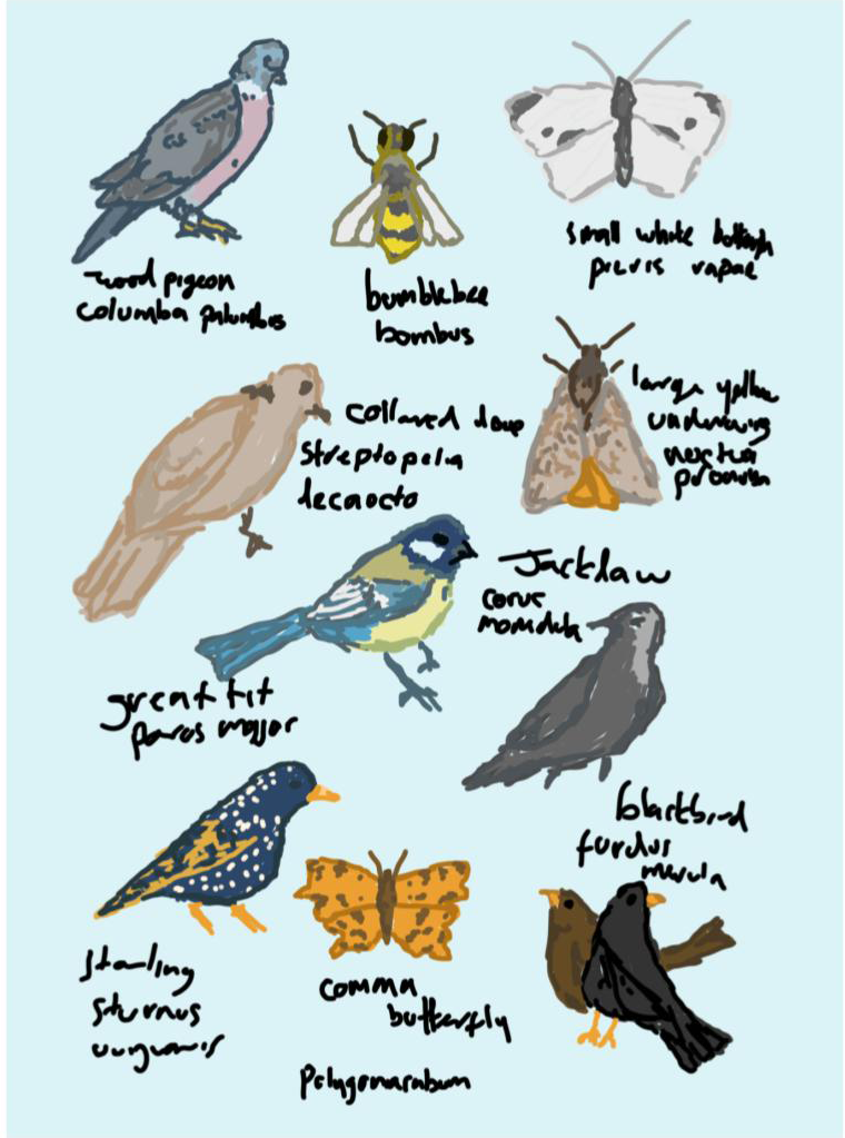
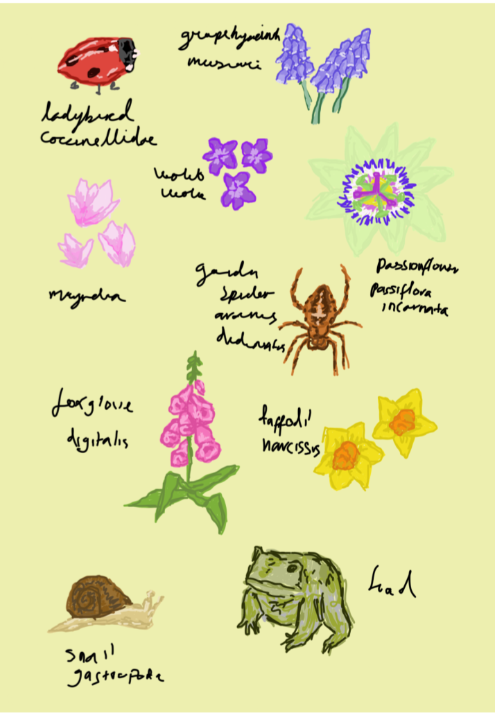
WILDLIFE
Wildlife Posters using hand drawn illustrations to create wildlife conservation style posters.
Employment
WILDLIFE
Wildlife Posters using hand drawn illustrations to create wildlife conservation style posters.
Thomas Burrows
Suffolk New College
Games Design
Games Design
TDB’s animations
During my time in Art and Design, I have developed a few videos, which are on YouTube. They are based on living in a radioactive wasteland.
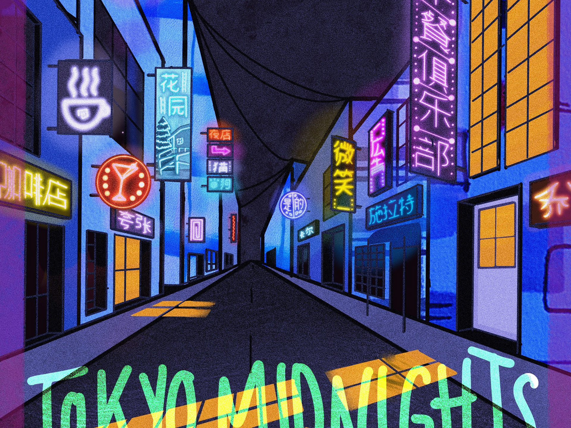
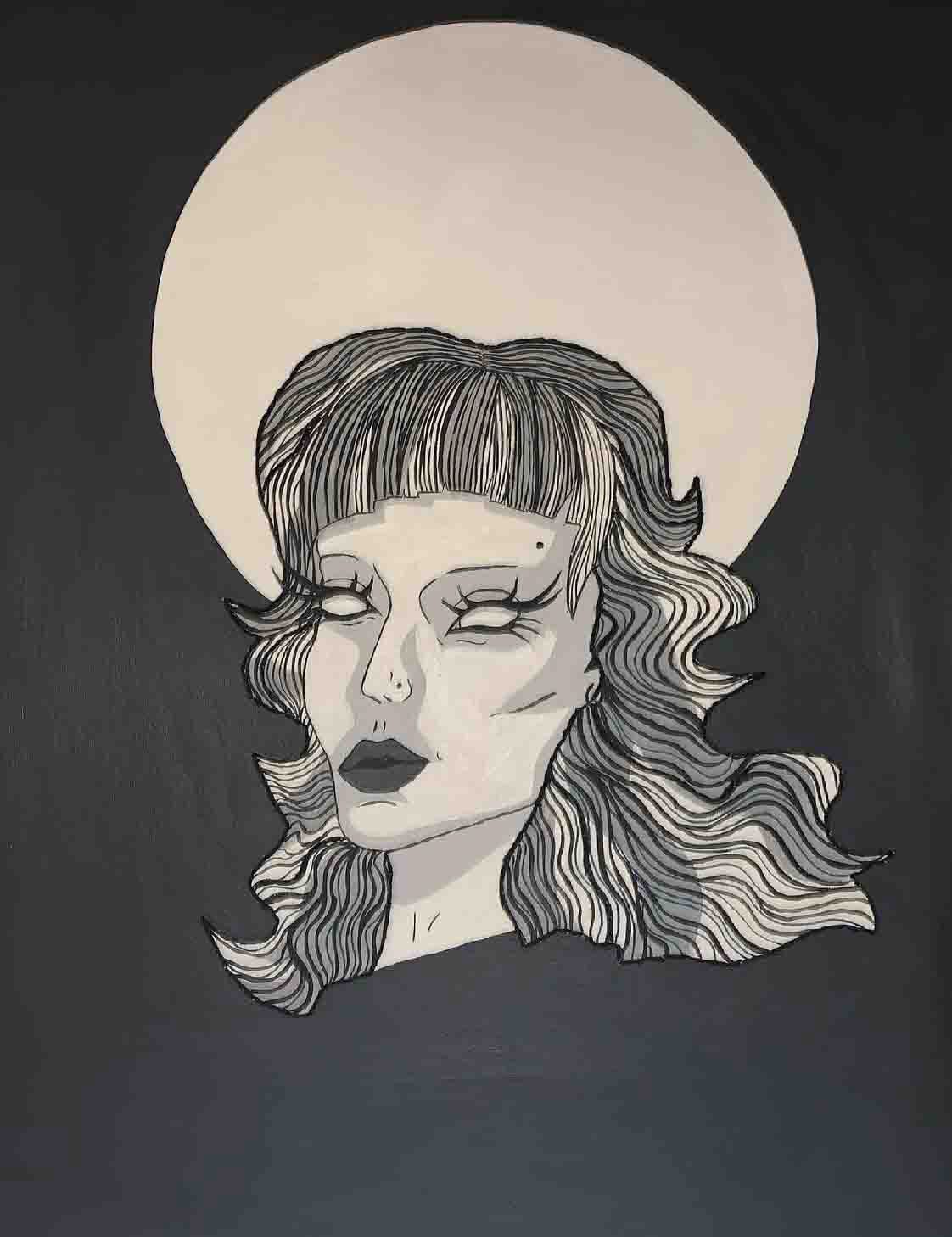
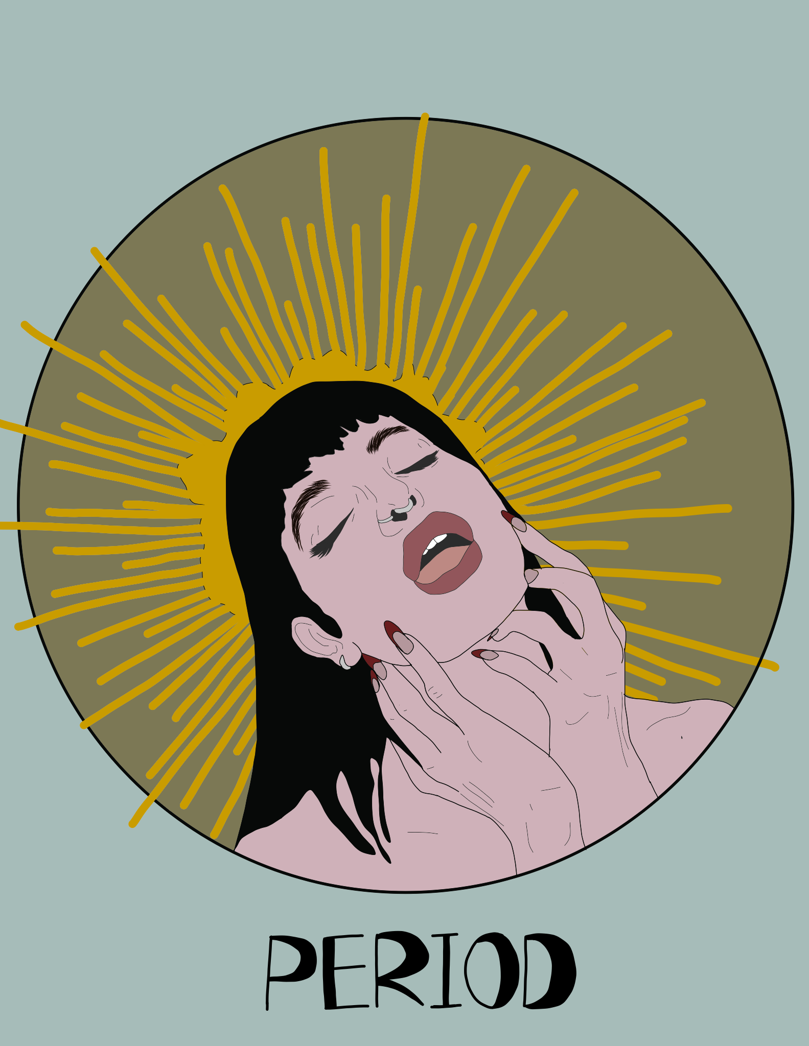
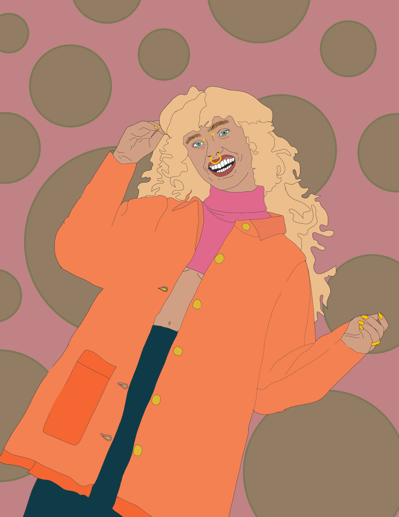
Shannon Dixon
Employment
Tarot Card inspired Feminine Image
Employment
Tarot Card inspired Feminine Image
Lizzie Dyes
Employment
Fashion
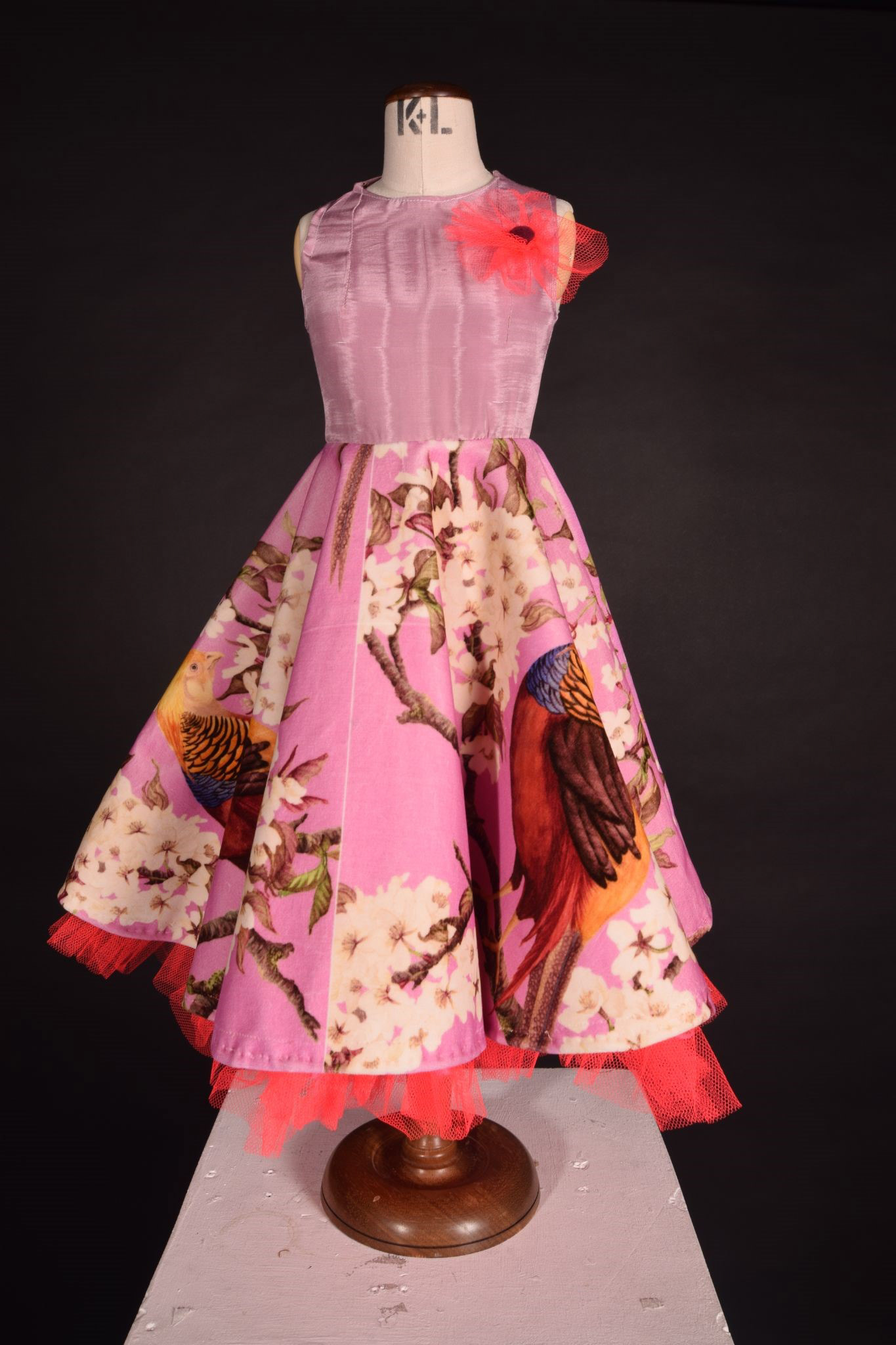
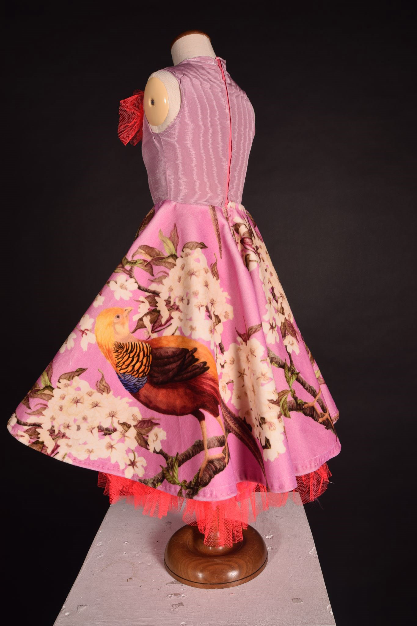
I have exhibited my dress I made in the style of Christian Dior. I researched different designers to decide what style I like. I thought I could use colour theory to make a dress that makes people feel happy and confident. I loved that Dior worked in his garden and used that in his work so I decided to tribute that in my work by using flowers and other garden imagery. I thought I could make this dress for the coming out of lockdown so the happy colours would be appropriate for that. I really love what I have made.
Sian Elliott
Anglia Ruskin Cambridge
BA (Hons) Illustration
BA (Hons) Illustration
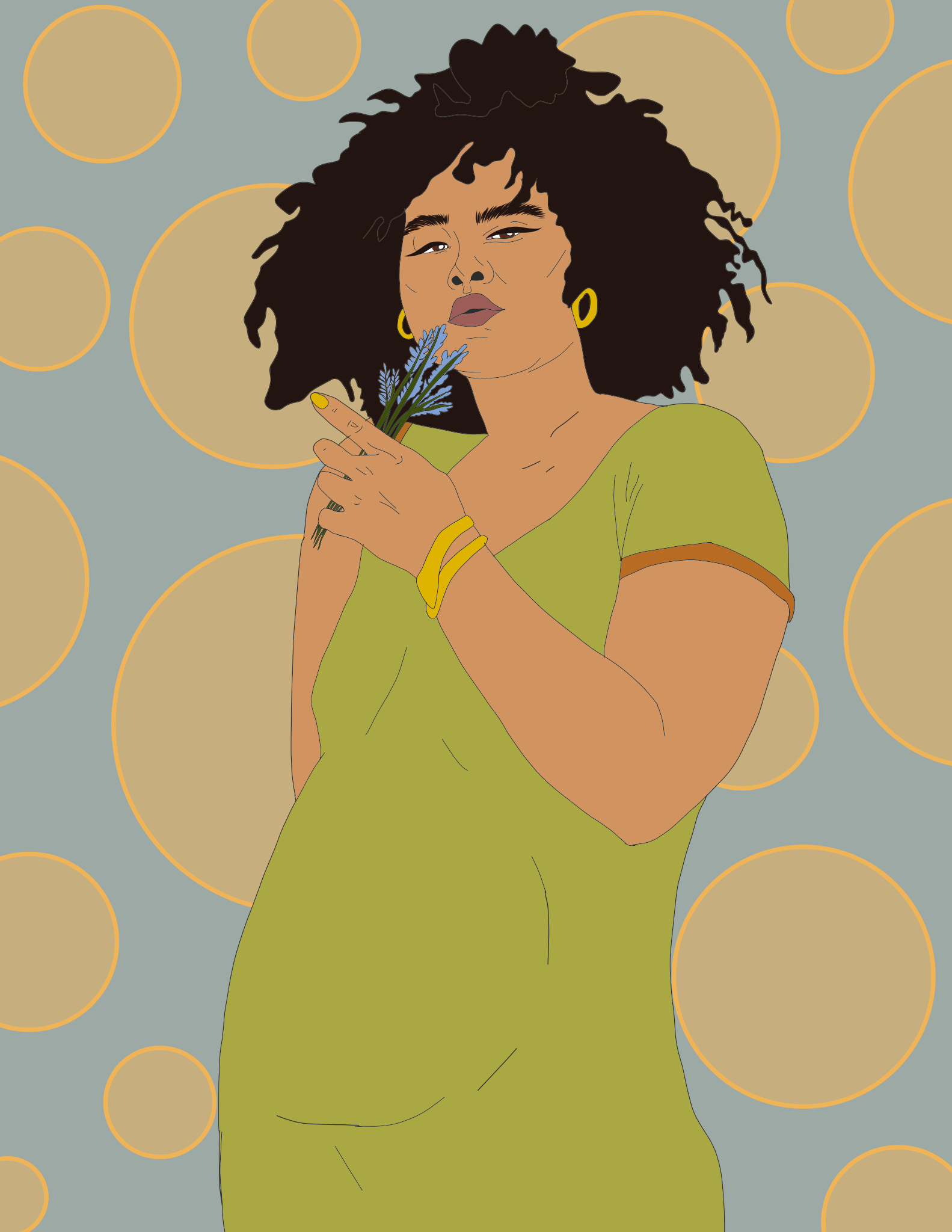
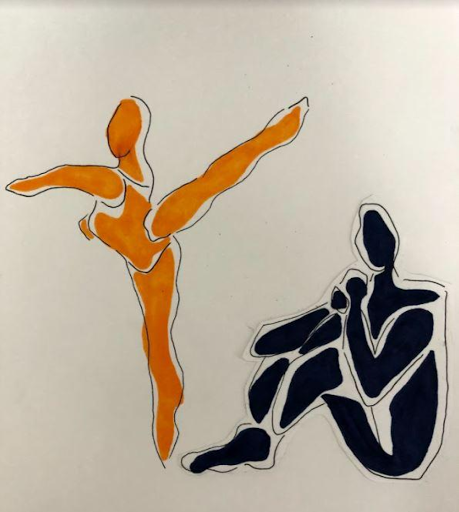
FEMINISM
Here you can see that I have looked into body image through the use of digital illustration. My theme being Feminism allowed me to deeply explore the inner workings of the female voice and all that freedom can be. I used a variation of colours from a colour palette base, to create a series of illustrations of strong women that would eventually go off to be in my Zine. I love how I was able to explore the way fashion is a pathway of being heard without literally having to use your voice.
Here you can see that I have looked into body image through the use of digital illustration. My theme being Feminism allowed me to deeply explore the inner workings of the female voice and all that freedom can be. I used a variation of colours from a colour palette base, to create a series of illustrations of strong women that would eventually go off to be in my Zine. I love how I was able to explore the way fashion is a pathway of being heard without literally having to use your voice.
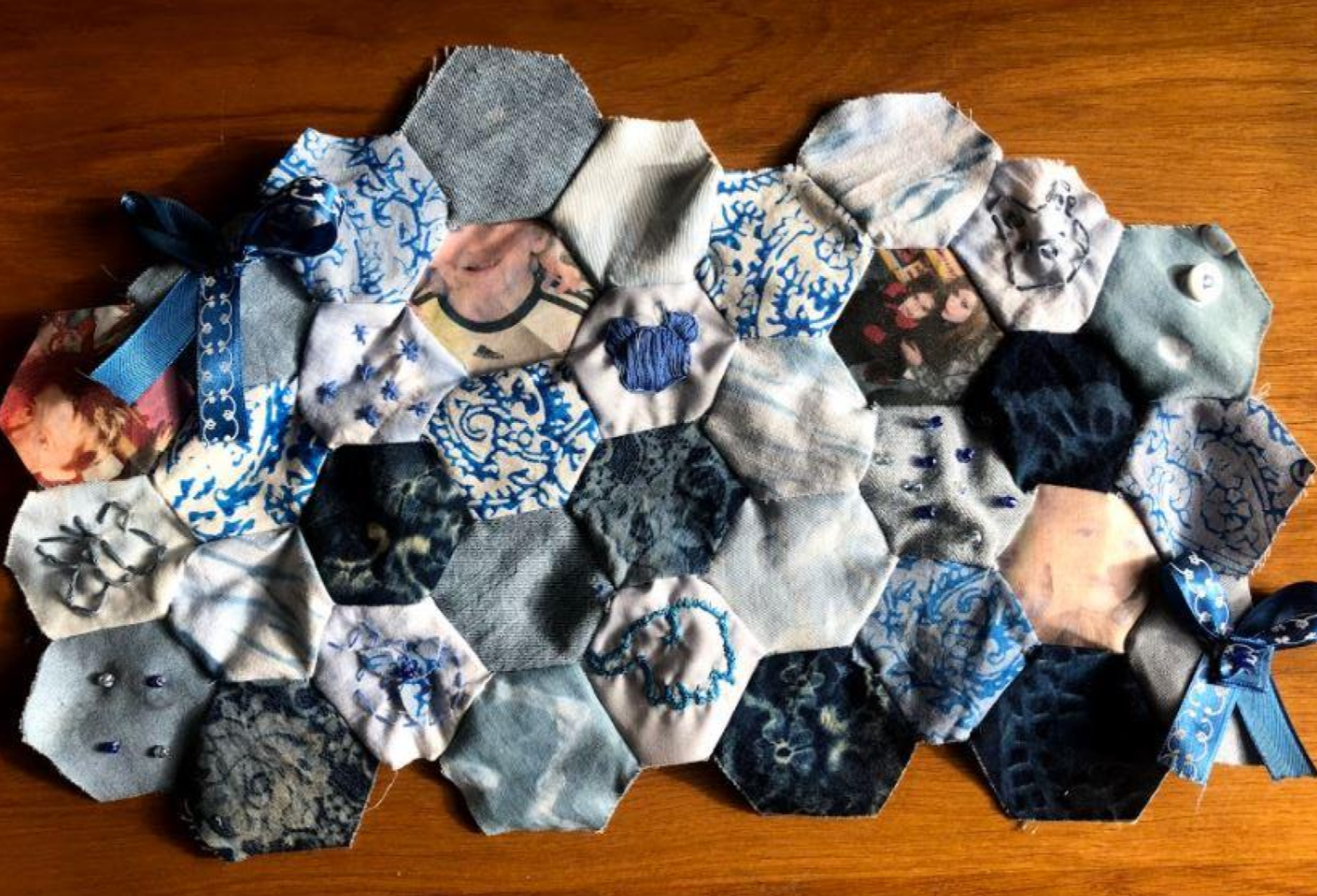
Emily Gillings
Employment
Nostalgic
Nostalgic childhood memories /memory Quilt .Textile based outcomes using traditional quilt methods .A restricted colour palette fusing digital imagery with traditional quilt techniques. and Transition project.
Employment
Nostalgic
Nostalgic childhood memories /memory Quilt .Textile based outcomes using traditional quilt methods .A restricted colour palette fusing digital imagery with traditional quilt techniques. and Transition project.
Giles Gladwin
University of Suffolk
BA (Hons) Graphic Design
BA (Hons) Graphic Design
Minimalism
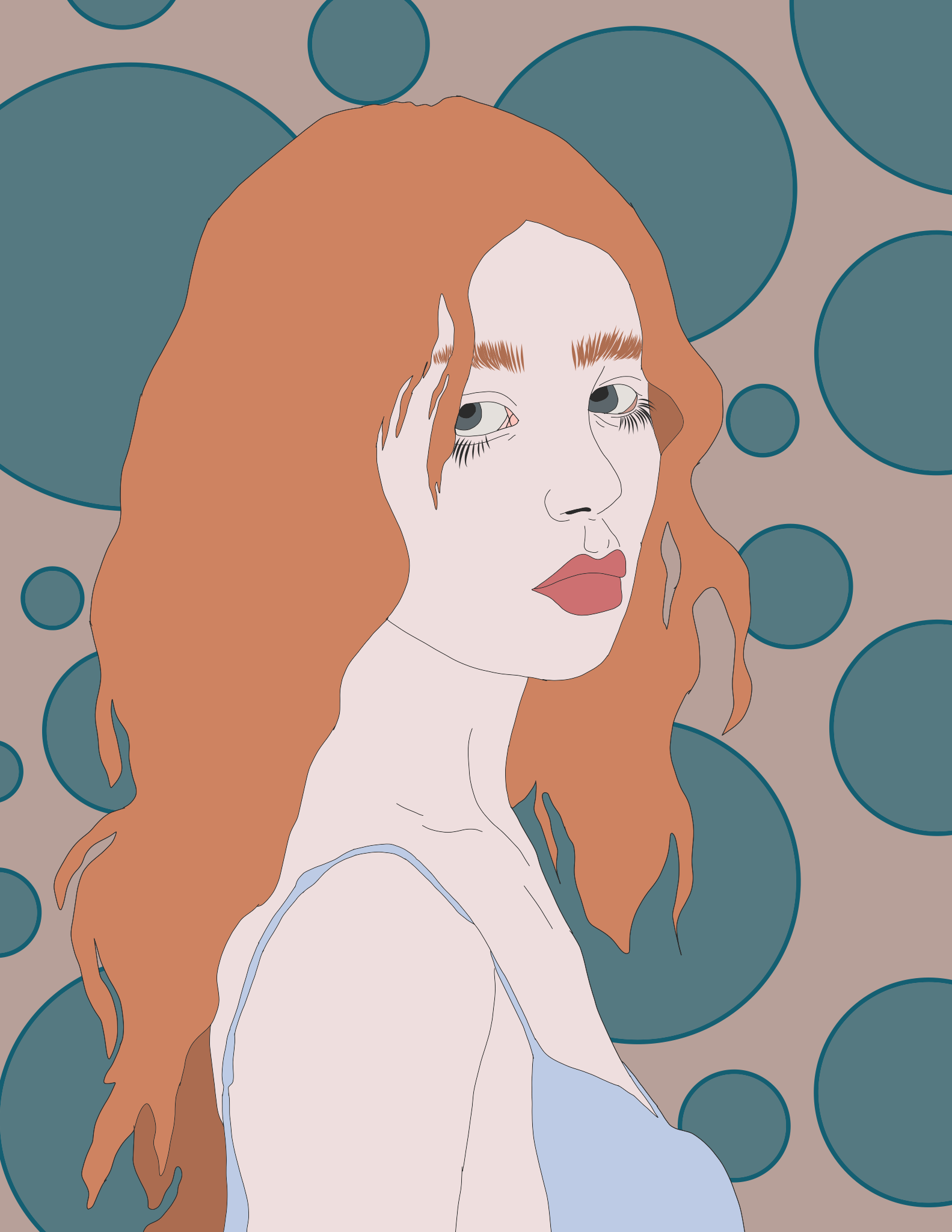
Daisy Holian
Employment
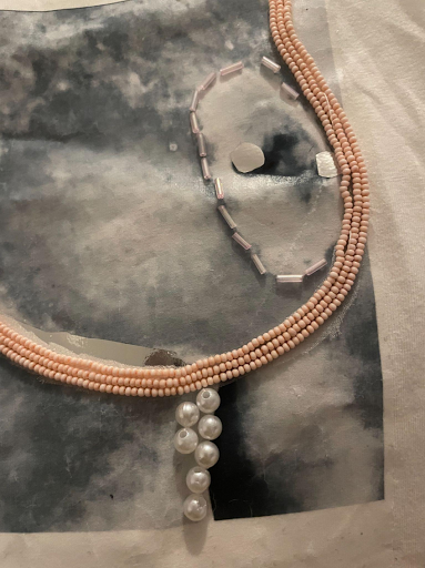
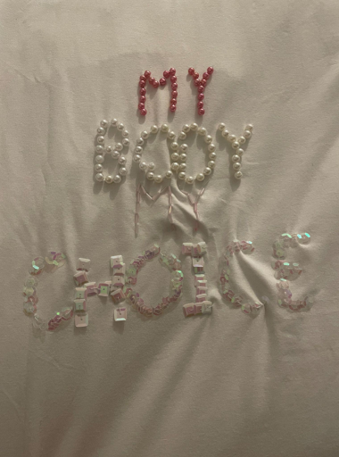
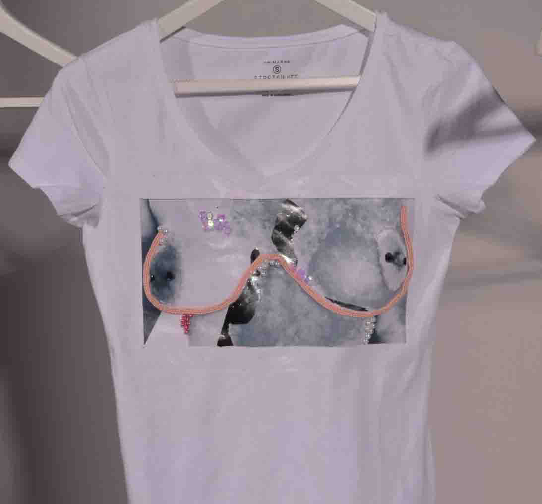
Feminism / Feminist Adornment
Employment
Feminism / Feminist Adornment
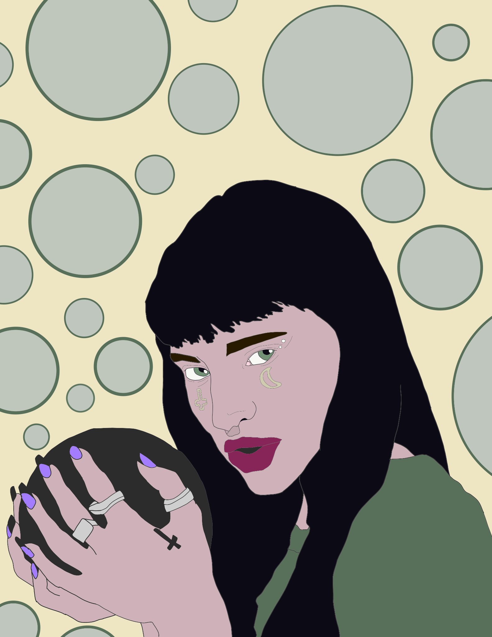
Kristine Levina
Employment
Clothing Brand Design
I have created multiple clothing designs with the theme of aquatic, ocean life. I used bright muted colours to make them more vivid and fit a colour theme. My designs consist of a koi fish design, an octopus design and a jellyfish design. I had these designs printed on shirts and hoodies I also took photos of these to see if I could find a way to advertise it to my target audience in an appealing way.
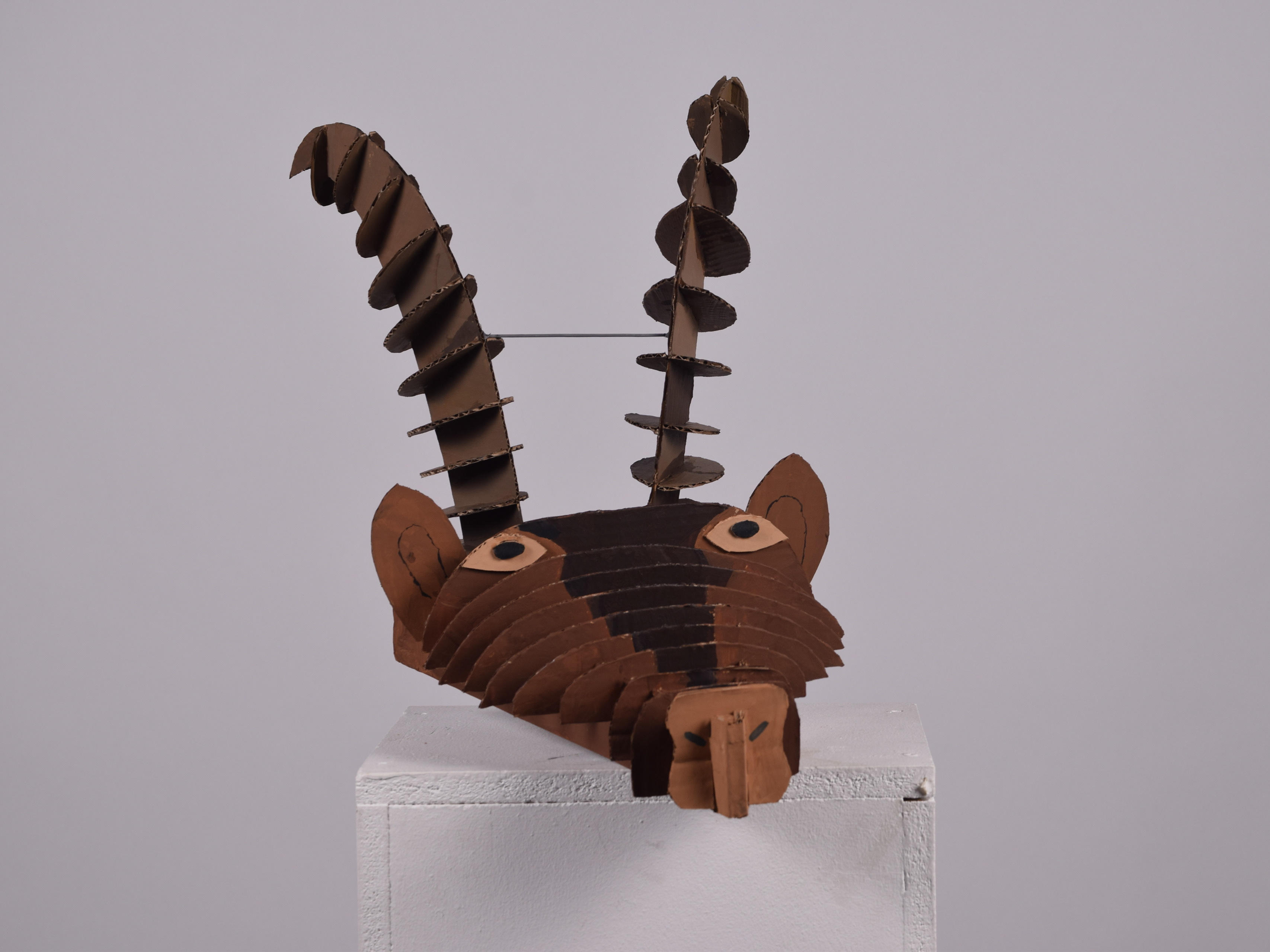
George Jessup
University of Brighton
BA (HONs) ART History
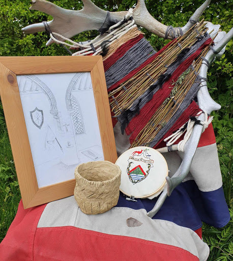
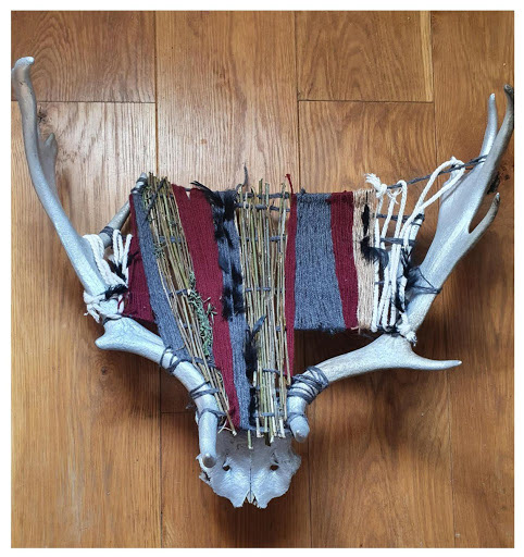
Saxon Weaving /Stags Head
University of Brighton
BA (HONs) ART History
Saxon Weaving /Stags Head
Alicia Jones
Norwich University of the arts
BA (HONS) GRAPHIC DESIGN
Norwich University of the arts
BA (HONS) GRAPHIC DESIGN
Ghost
I have exhibited a ghostly image. With my theme being ghosts, I have explored different colour backs and with these exhibited pieces that all may have a different feel to them. The green I have chosen because it brings out the whiteness in the ghost, also with the detail in the pops of colour, with the yellow and also the deep circles of green, it also displays the typography of ‘ghost’ and makes it stand out really well so you can get the whole entire picture. Then by adding the use of the ghosts tongue gives it a personality and lifts the image up to give it a more jockey feel.
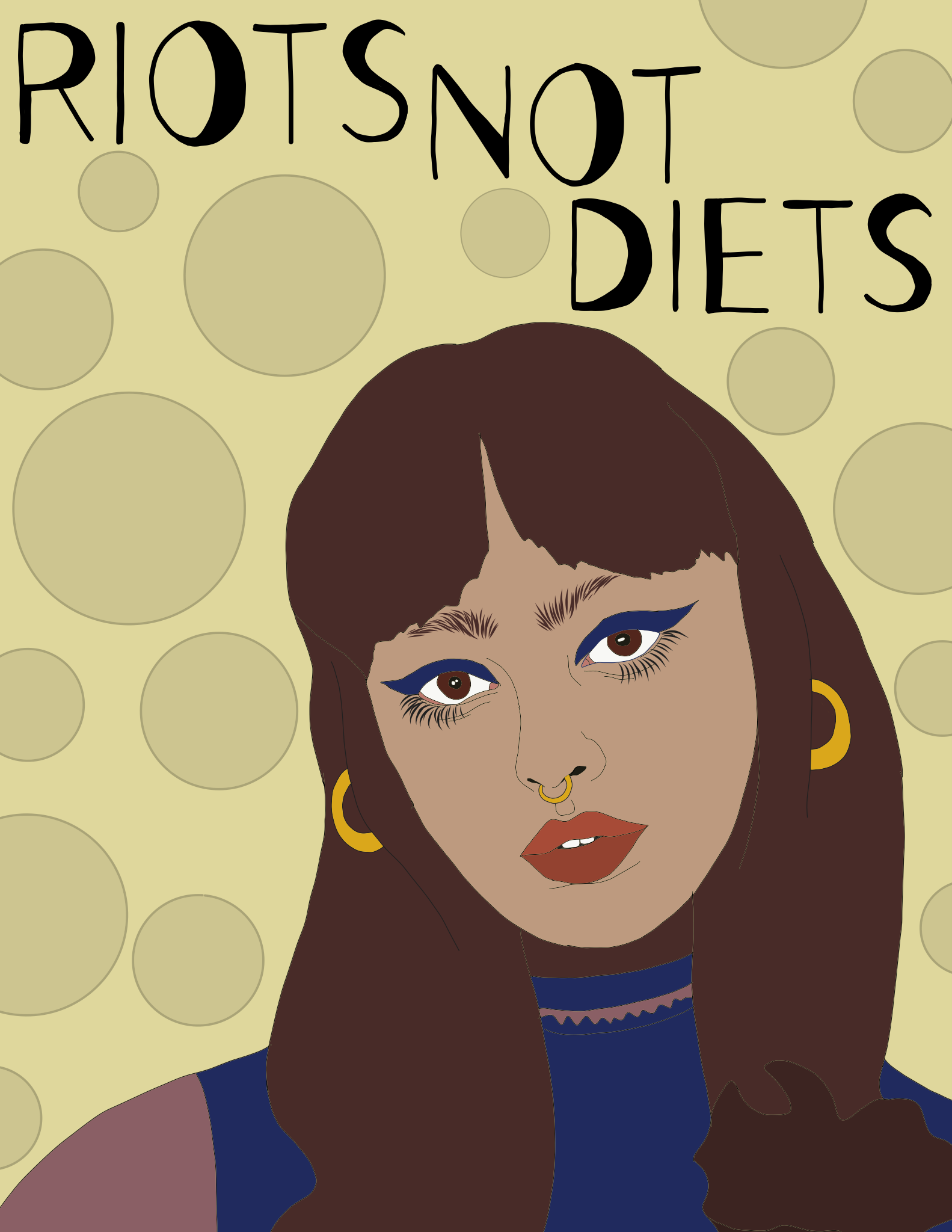
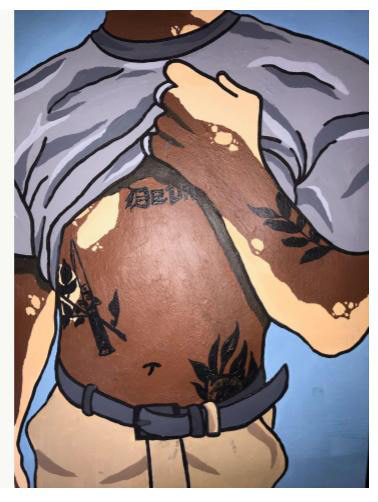
Joe Lavington
Employment
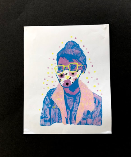
Men's mental health
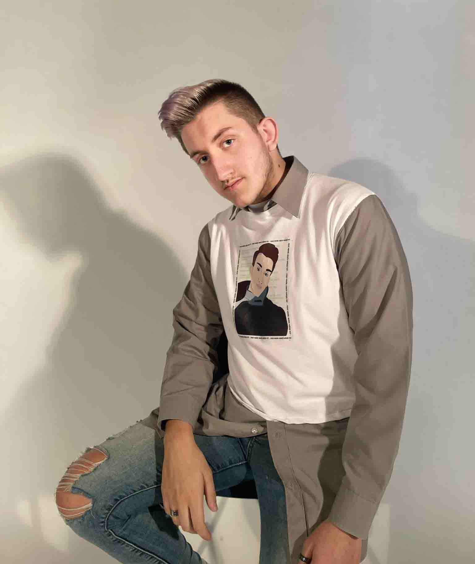
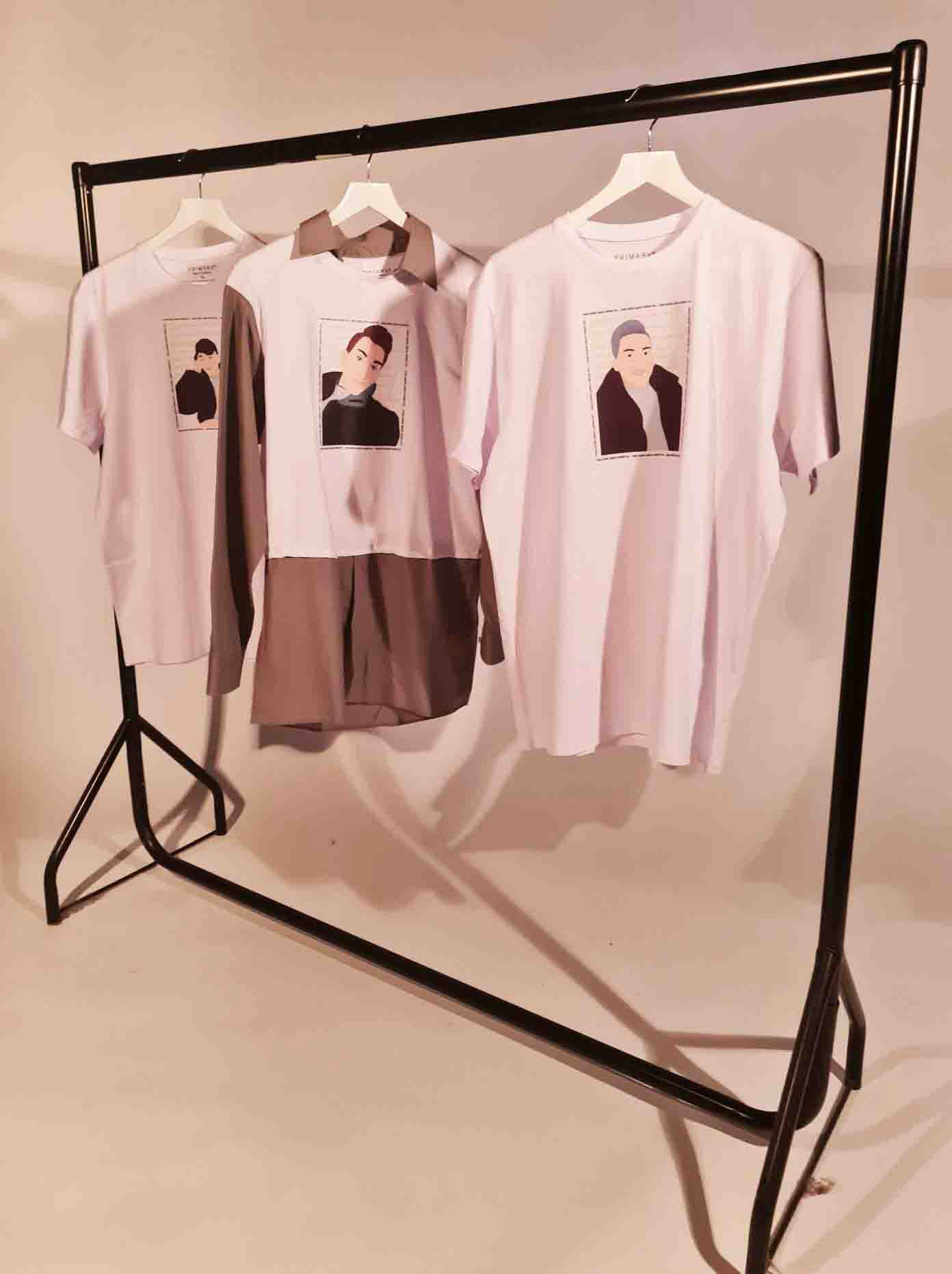
I have created three signature items of clothing which relates to the idea of men's mental health and how men's mental health isn't spoken about as much as I believe it should be. During this process I explored the ideas behind men's mental health and different mental health organisations and believe this would be a perfect opportunity to voice my opinion in a fashion based way. I wanted to create a twist and make it more personal by doing this. I added a self digitally drawn portrait onto the front of my T-shirt and also kept it personal by using local news article headlines as a background to the image itself.
Layla Nunn
Employment
Tattoos in Fashion
Employment
Tattoos in Fashion
I’m exhibiting my photography outcomes to my fashion fmp about mixing traditional Japanese tattoos with current contemporary fashion trends.
Abi Palmer
Freelance Photographer
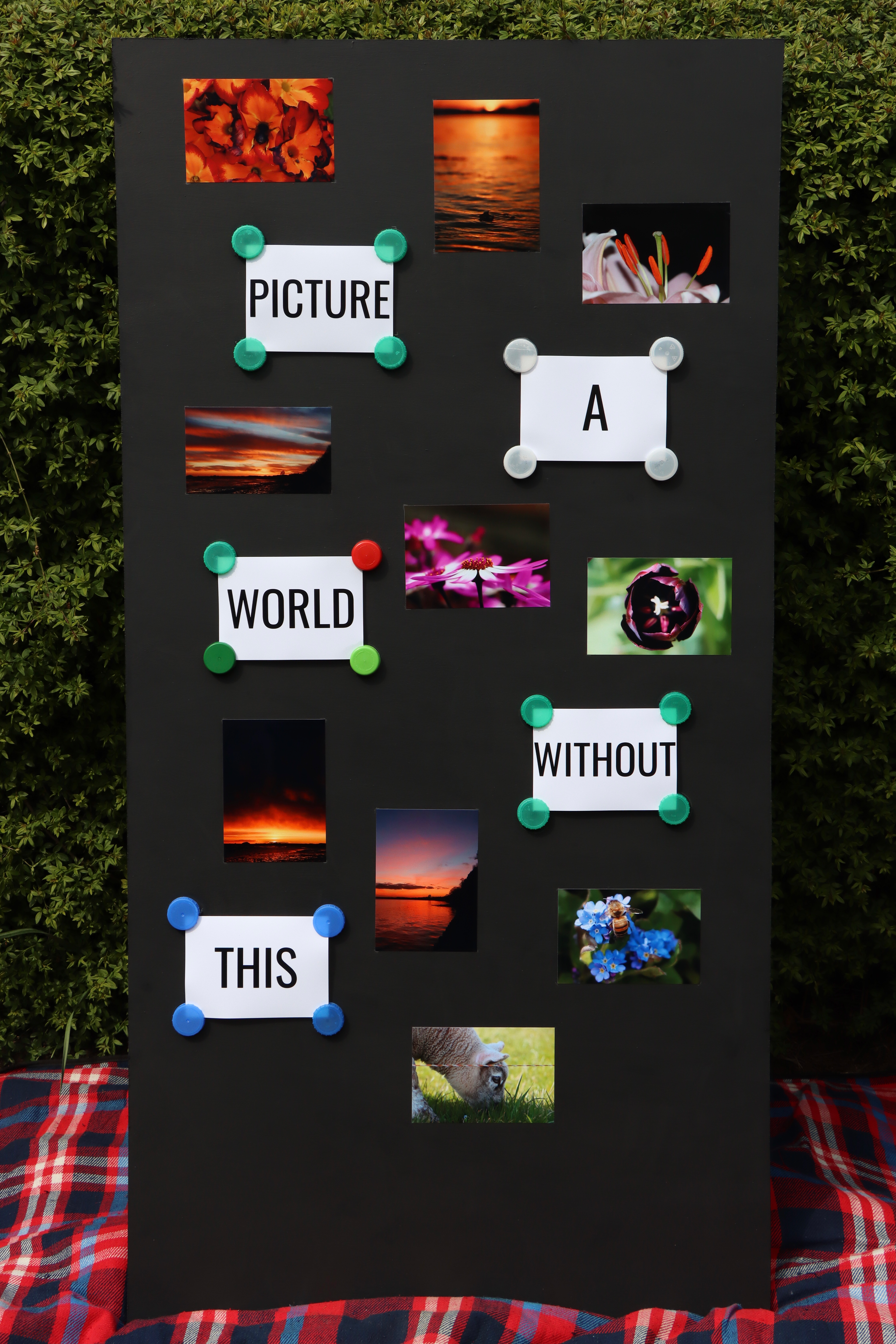
Nature and Pollution
I have exhibited a collection of photos and a slogan which represents the beauty of nature and the effects of climate change. With my topic being nature and climate change, I have experimented with different ways to represent the effects of climate change with nature and how to reuse and recycle rubbish left lying around. I reused old bottle caps that I collected to hang my slogan up to represent that we can reuse a lot of our rubbish, while including my photography work that represents the beauty of nature. I then linked my slogan with my photos metaphorically to help people understand that our world would be ugly without the beauty of nature, which will hopefully inspire them to do something about climate change and help the planet heal.
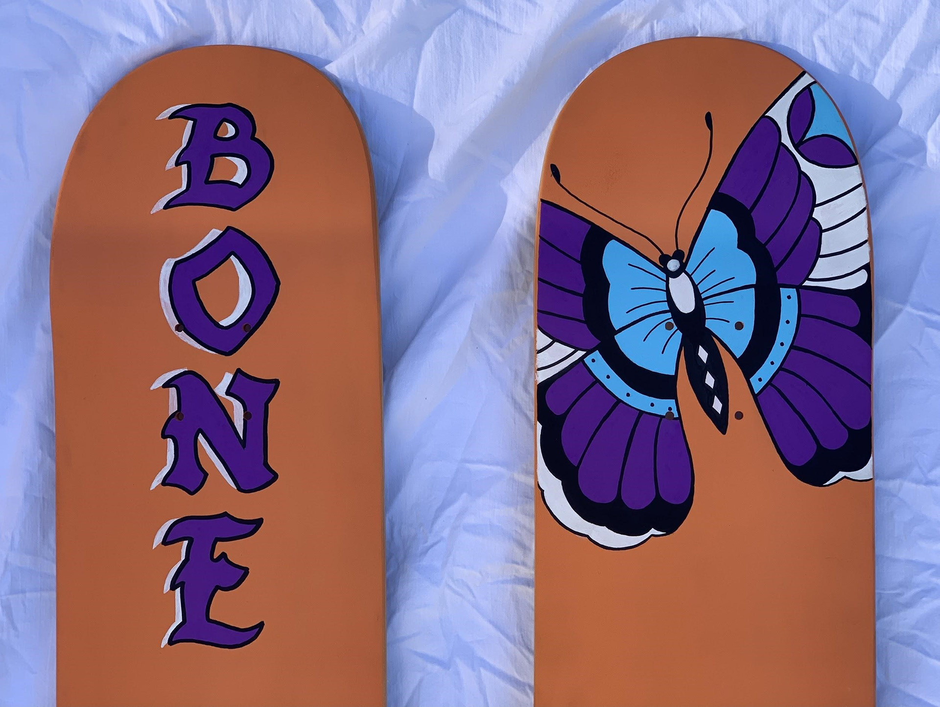
Niamh pipe
University of Suffolk
BA (Hons) Graphic Design Illustration
BA (Hons) Graphic Design Illustration
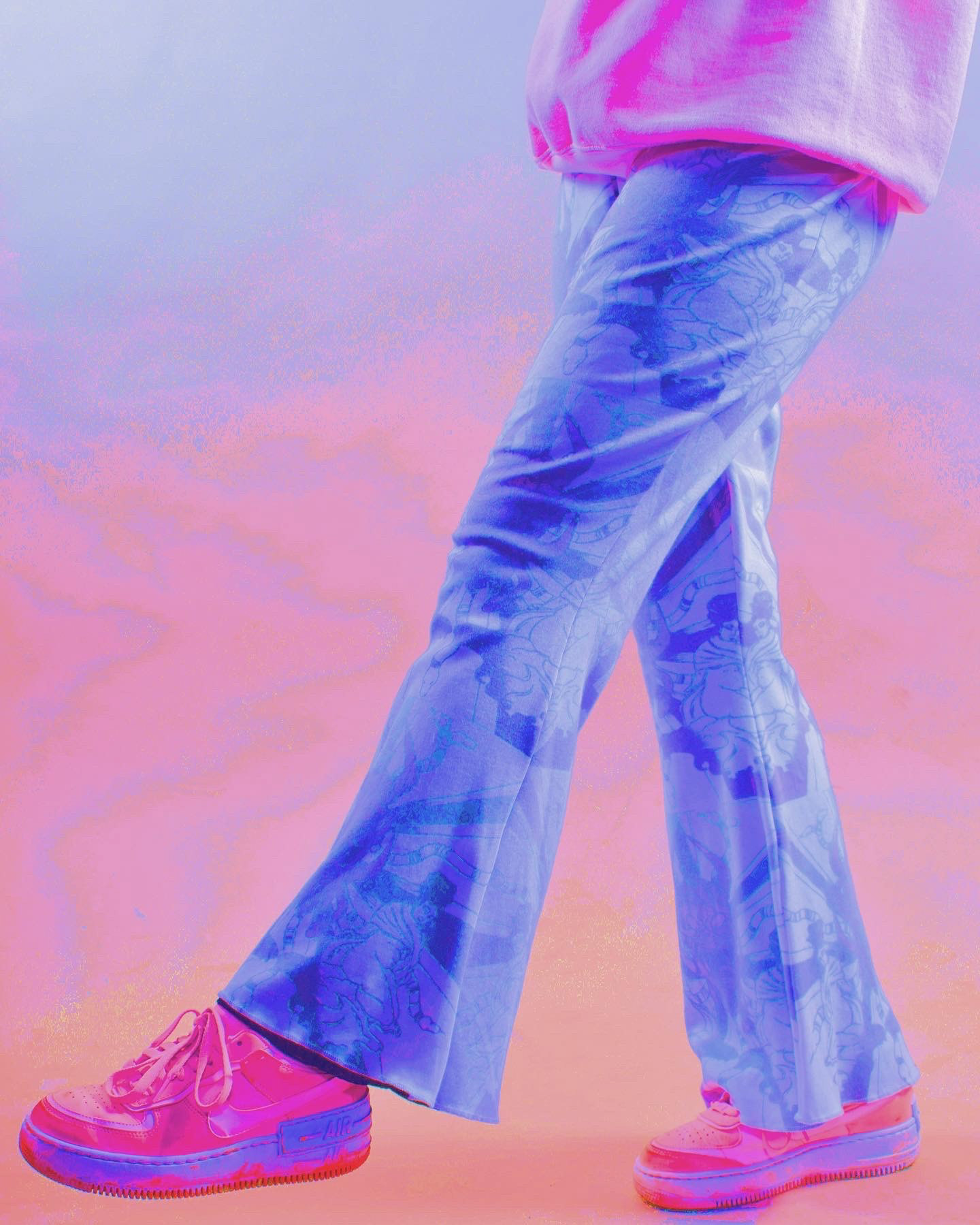
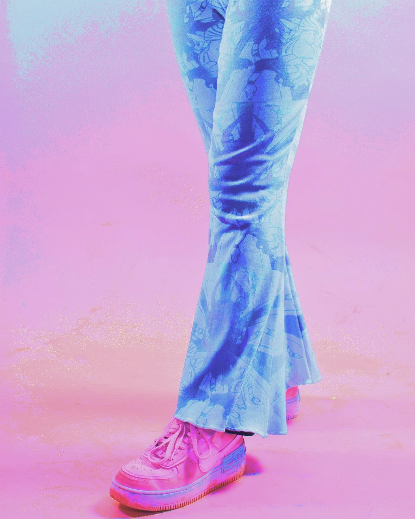
BONELESS
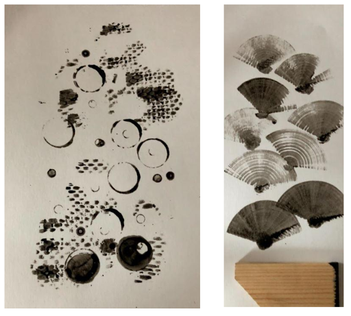
Kea Rutson-Edwards
Anglia Ruskin Cambridge
BA (Hons) Graphic Design
BA (Hons) Graphic Design
Mental Health Awareness Comic
I have created a silent comic to bring awareness to mental health. This was created using original analogue techniques mixed with new digital techniques to create a unique outcome.
Paddy Ryan
Employment
People /Beauty / Inclusivity
Employment
People /Beauty / Inclusivity
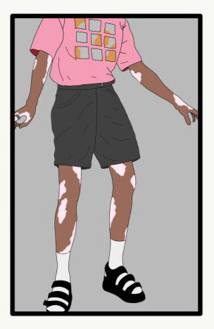
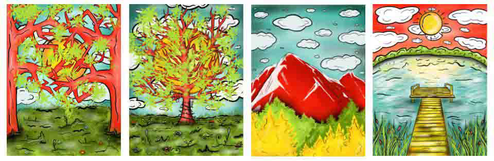
Paulina Samoskaite
Norwich University of the Arts
BA (Hons) Illustration
BA (Hons) Illustration
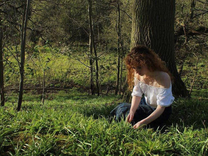
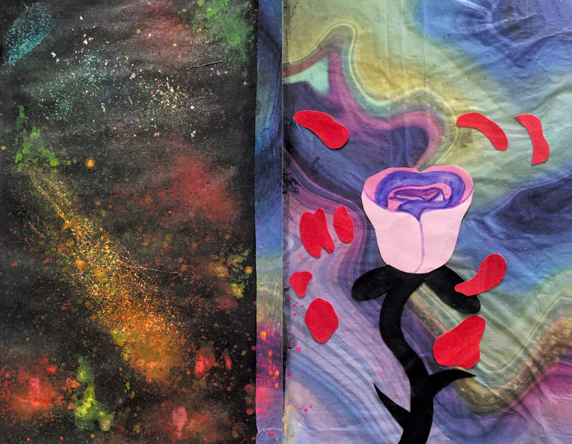
Emotional Responses to Nature
These are four art pieces I have created using a digital software called Procreate. I have responded to the theme Emotional Responses to Nature by not also creating nature art pieces but also showing how these nature art pieces and nature in general can have an impact on our emotions. The greens, blues, reds and yellows were used because these colours are suggested to bring cheerful, positive emotions. Using a black and white technical brush tool to outline and add detail to these four pieces has helped these pieces stand out more. Using the same colours and context for the four art pieces has made them look well together.
These are four art pieces I have created using a digital software called Procreate. I have responded to the theme Emotional Responses to Nature by not also creating nature art pieces but also showing how these nature art pieces and nature in general can have an impact on our emotions. The greens, blues, reds and yellows were used because these colours are suggested to bring cheerful, positive emotions. Using a black and white technical brush tool to outline and add detail to these four pieces has helped these pieces stand out more. Using the same colours and context for the four art pieces has made them look well together.
Katie Sandford
University of Suffolk
BA (Hons) Graphic Illustration
BA (Hons) Graphic Illustration
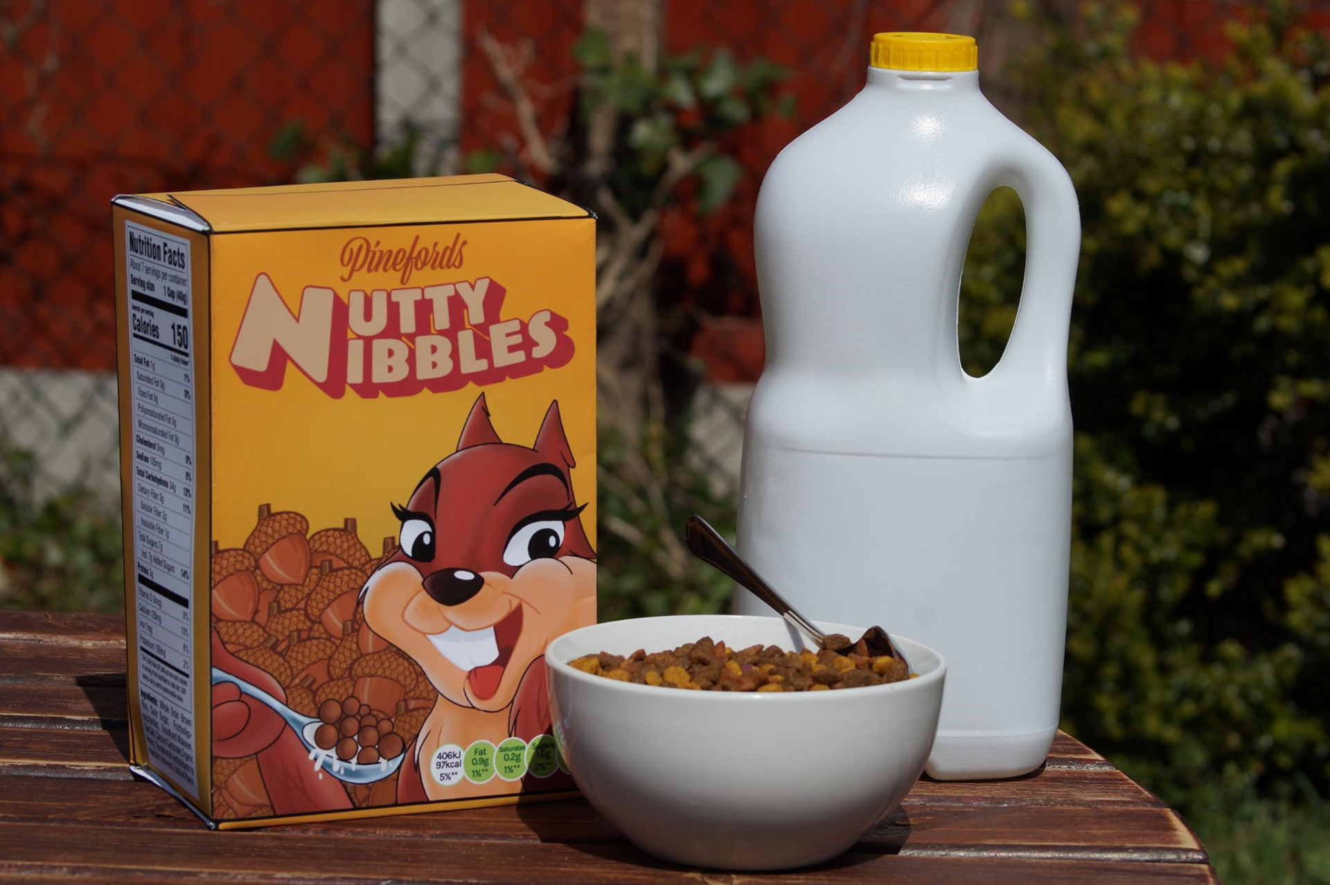
Cartoon Characters in daily life
I have exhibited my final piece of my cereal box I fully designed using Adobe Illustrator and Procreate. I gave myself the theme of applying cartoon characters in more day to day situations to show how the use of characters are used outside the world of animation. During my exploration stage I looked into animation to challenge my illustration skills, during this process I made the character “Snickers the Squirrel” who I wanted to develop further but in a different way this being the character applied in product design.
Azura Seeley
Norwich University of Arts
BA (Hons) Fashion Communication and Promotion
Norwich University of Arts
BA (Hons) Fashion Communication and Promotion
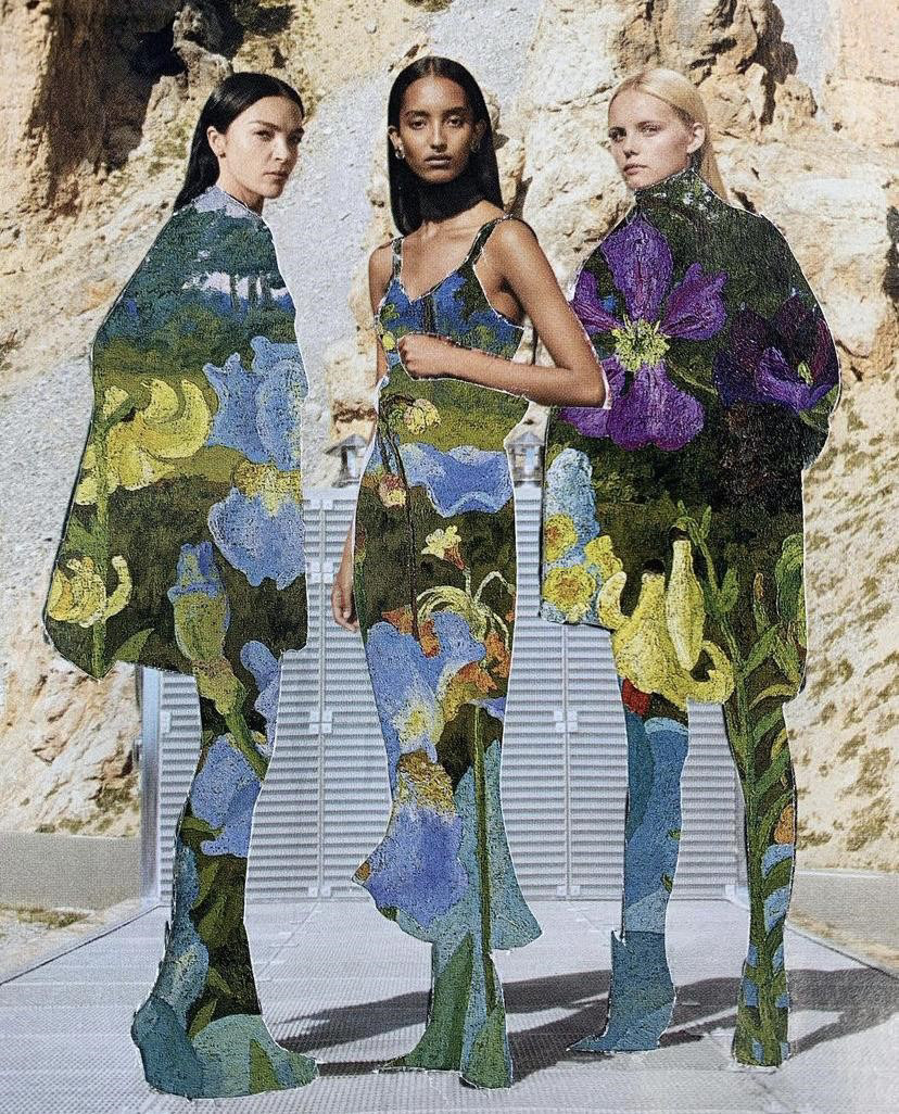
Sustainable Fashion Zine
Moss Mclennan
UWTSD
BA (Hons) Set Design
BA (Hons) Set Design
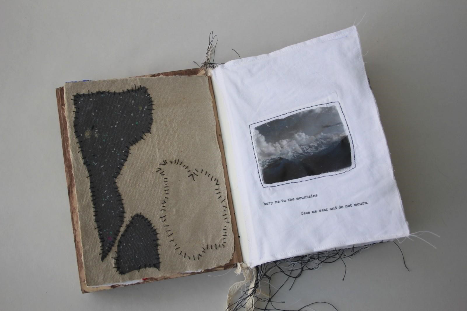
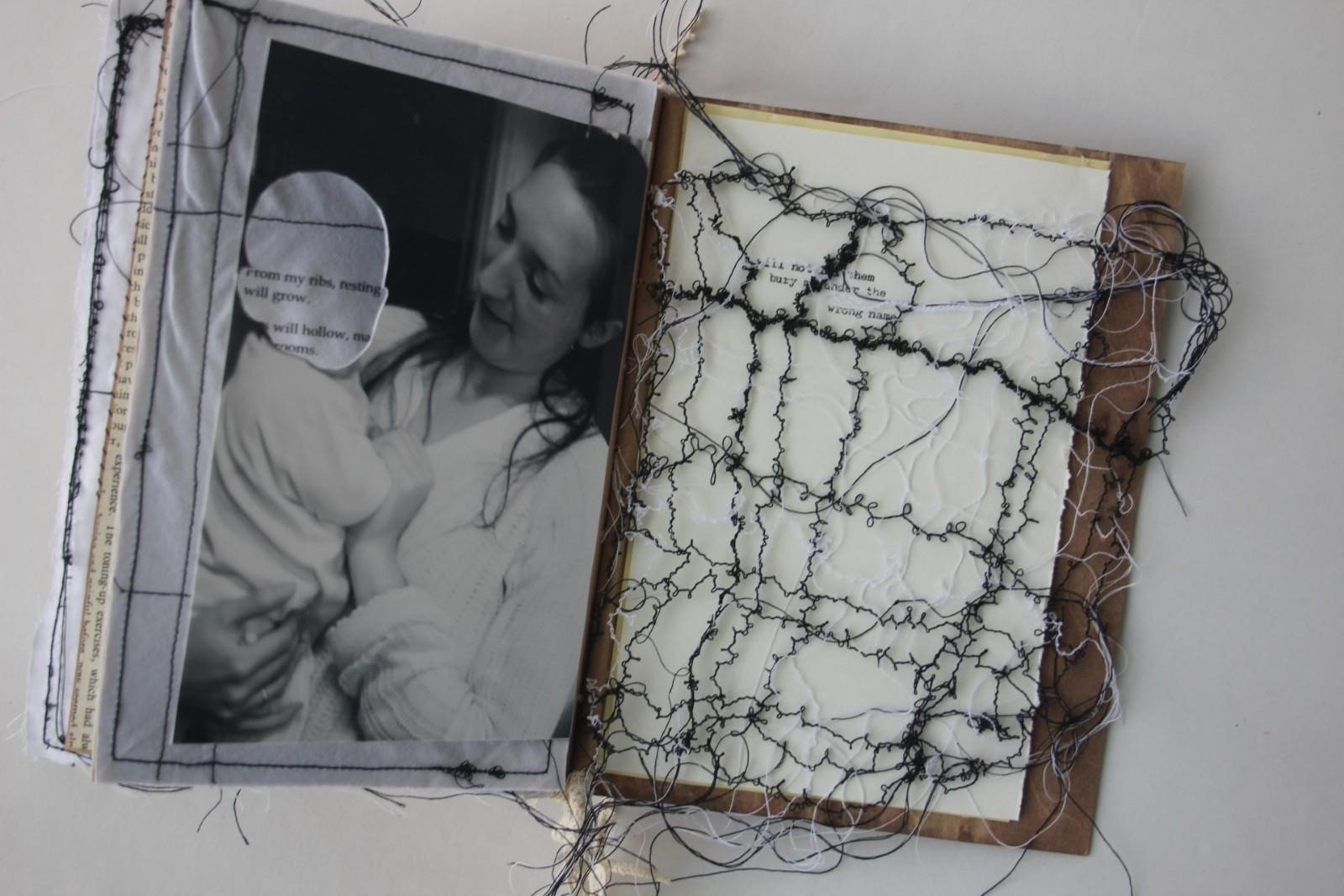
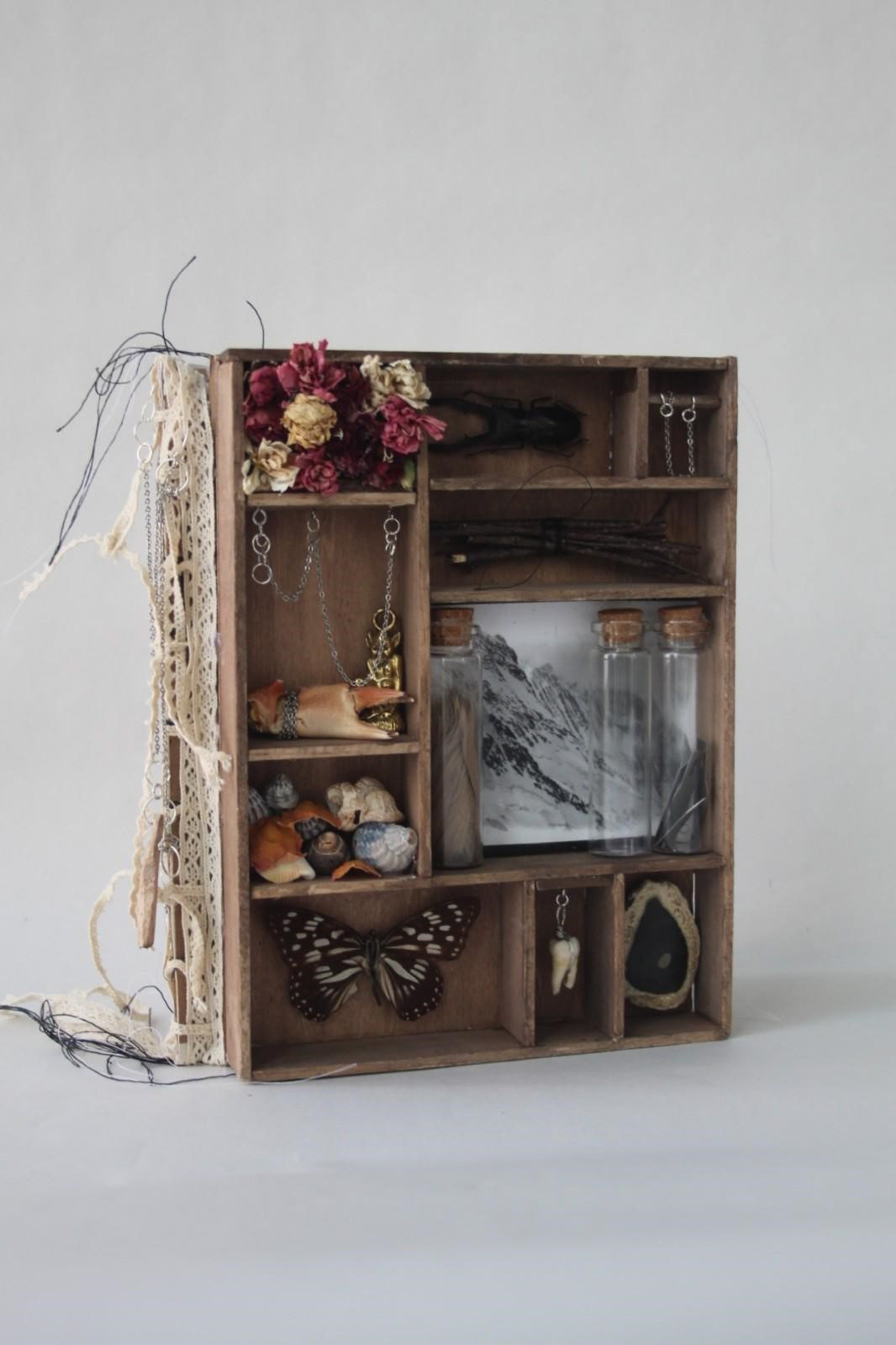
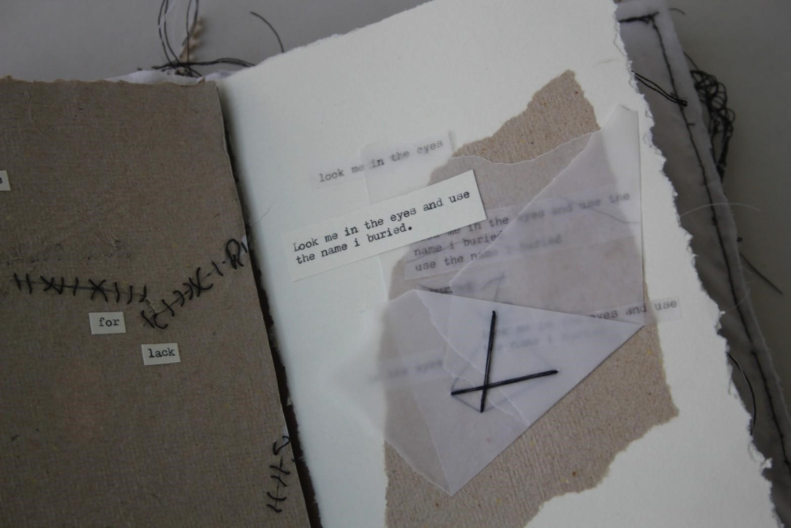
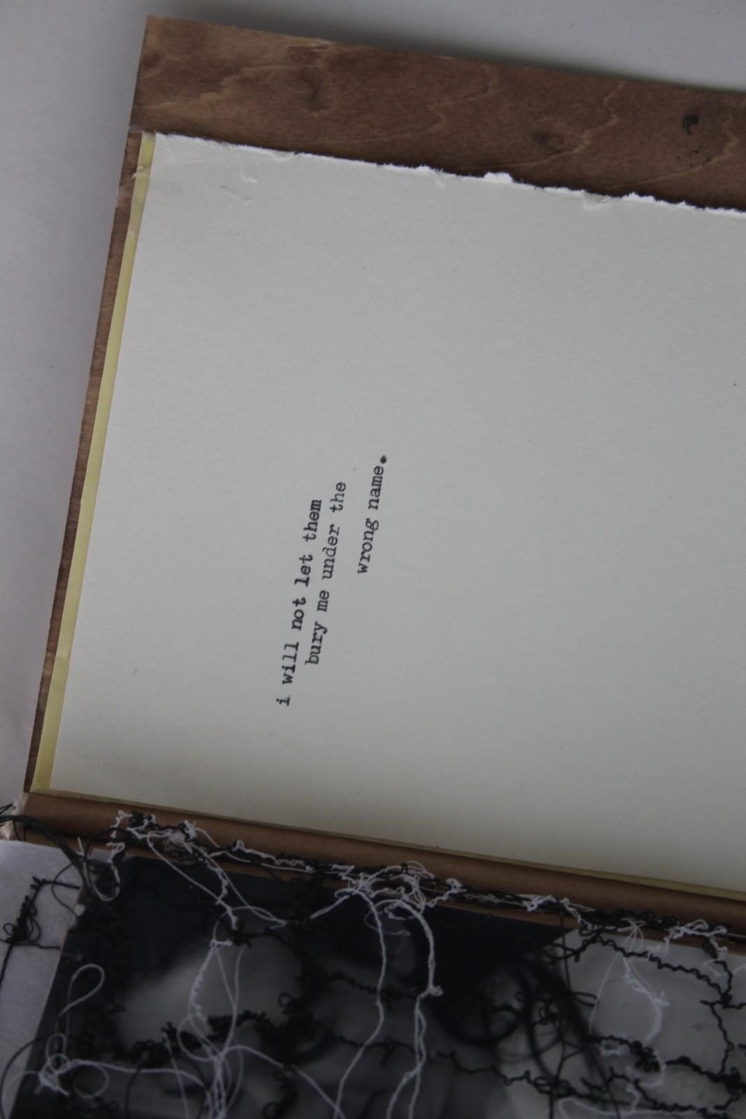
Bury me in the mountains
I have created a book exploring my gender and gender identity, i wanted to explore the trans experience and use my art and poetry to do this. I created the cover to mimic an old type tray and filled it with things that evoke my own gender euphoria. I made 18 different pages to go in the book, i used a mixture of found materials and handmade paper, i mixed imagery that relates to me and my experiences along with my own poetry and writing.
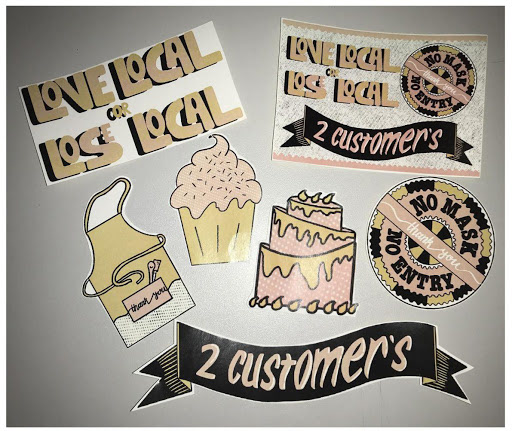
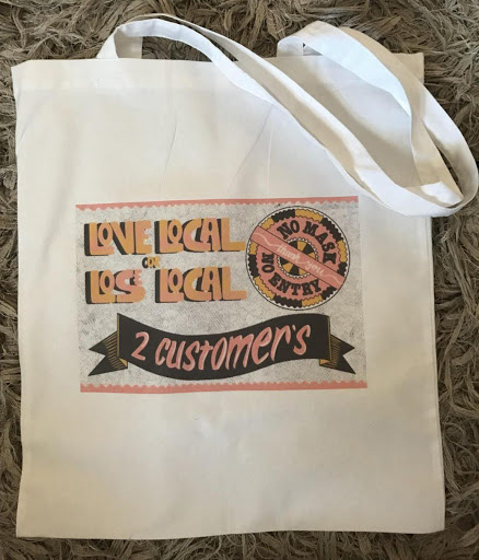
Summer Townley
Norwich University of the arts
BA (Hons) Graphics Design
Typography /Shop Local Brand /Campaign
Norwich University of the arts
BA (Hons) Graphics Design
Typography /Shop Local Brand /Campaign
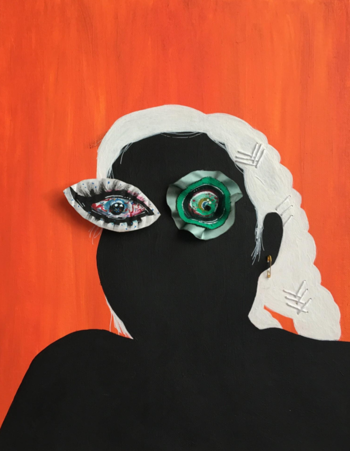
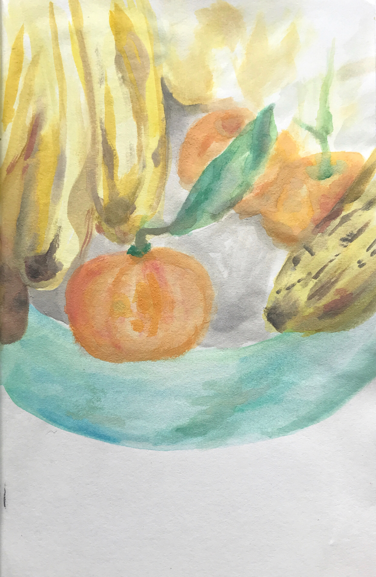
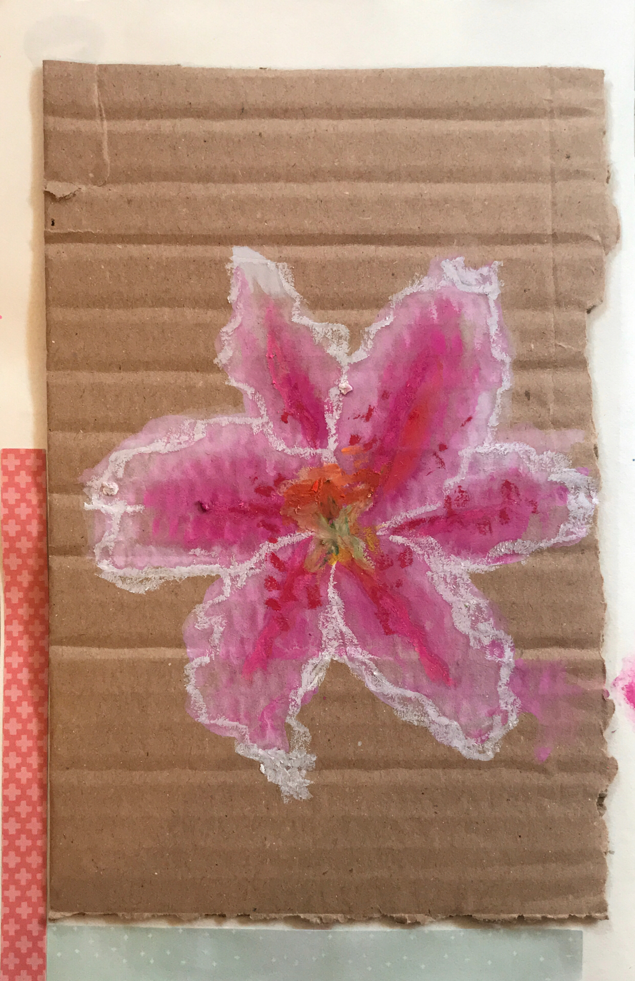
Holly Turnbull
University of Suffolk
BA (Hons) Graphic Design Illustration
Art Journal
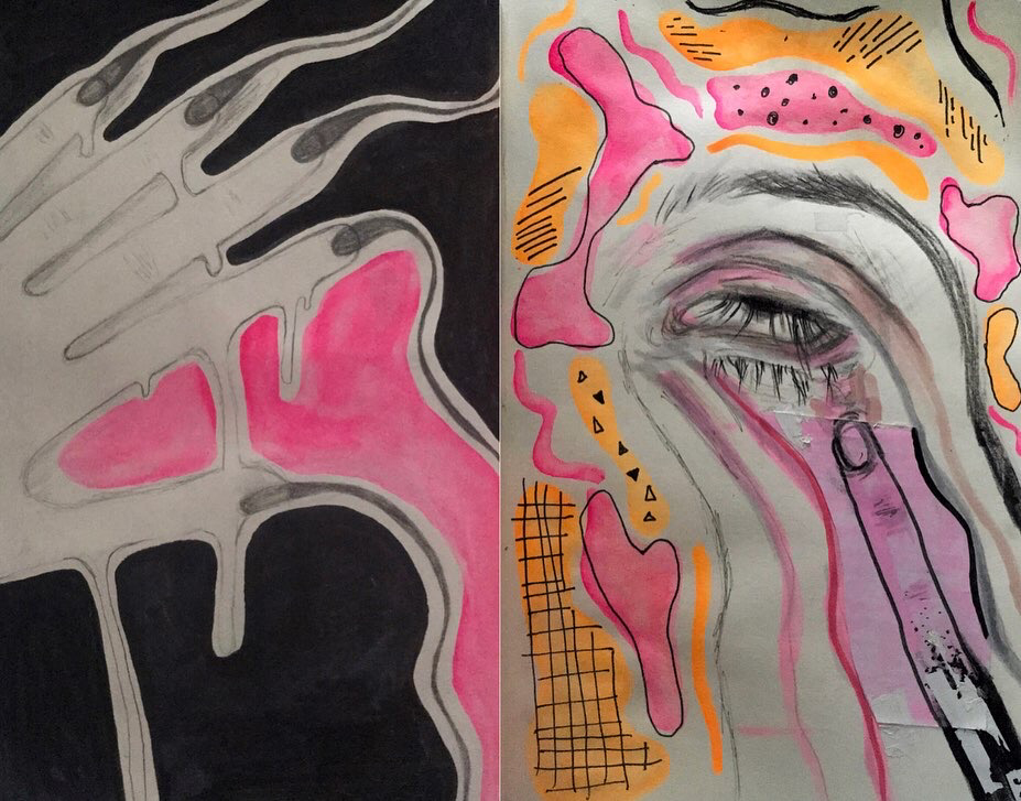
I have exhibited a collection of pages from my art journal. I have used a range of materials such as water colour, gouache, oil pastel, paper collage and ink. My aim was to be experimental with the pages, I have explored different styles and materials with these exhibited pages. The art journal was a form of self-reflection and development. I took visual inspiration from my surroundings, mainly nature. This is shown in the observational art I did for the flower and fruit. The colourful pages with the collaged flower and spray effect was inspired by one of my favourite series called ‘The Midnight Gospel’ and I tried to match up to the psychedelic style they use. My art style normally includes a melted/drip form which is what I did for the hand and extended the features for the eye page.
University of Suffolk
BA (Hons) Graphic Design Illustration
Art Journal
I have exhibited a collection of pages from my art journal. I have used a range of materials such as water colour, gouache, oil pastel, paper collage and ink. My aim was to be experimental with the pages, I have explored different styles and materials with these exhibited pages. The art journal was a form of self-reflection and development. I took visual inspiration from my surroundings, mainly nature. This is shown in the observational art I did for the flower and fruit. The colourful pages with the collaged flower and spray effect was inspired by one of my favourite series called ‘The Midnight Gospel’ and I tried to match up to the psychedelic style they use. My art style normally includes a melted/drip form which is what I did for the hand and extended the features for the eye page.
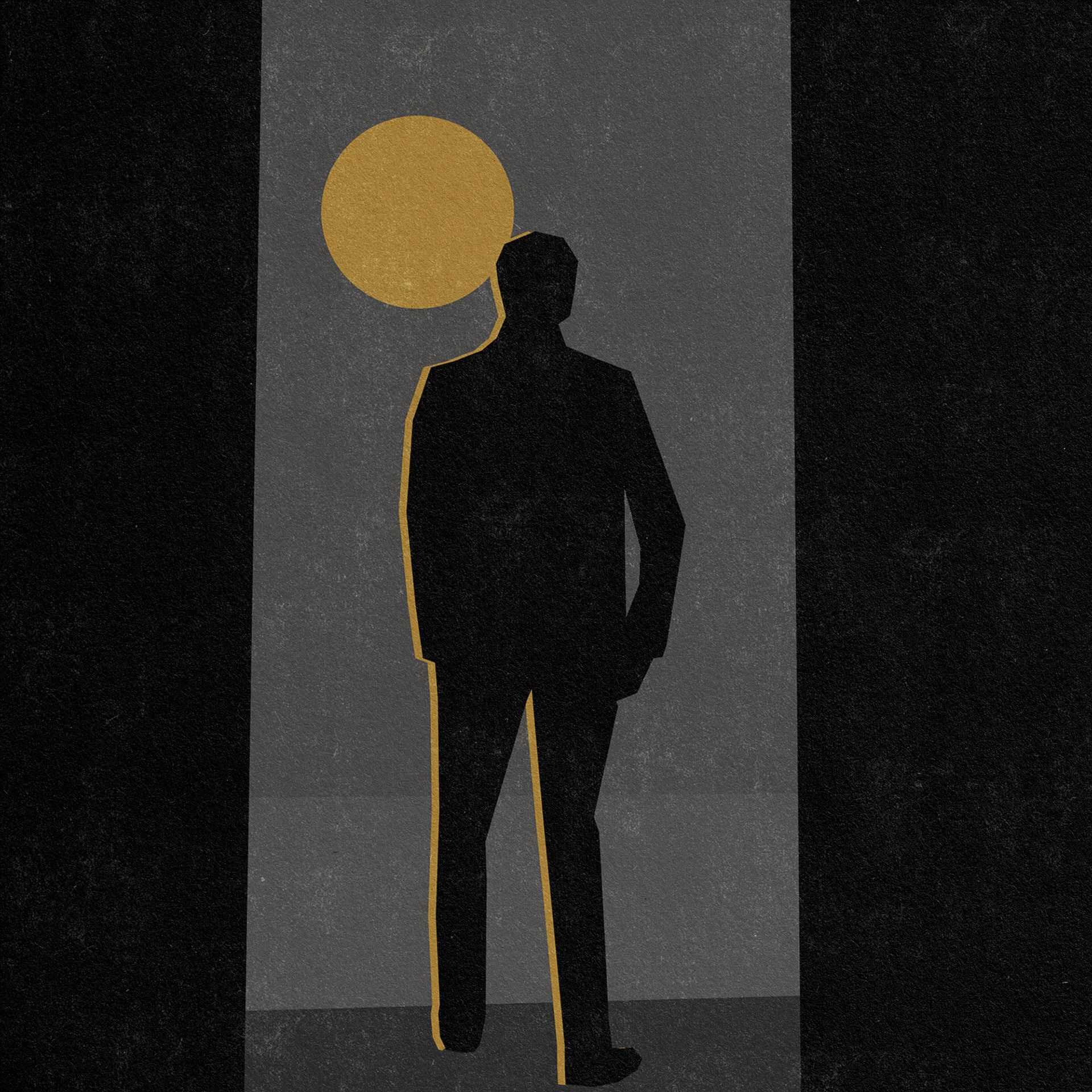
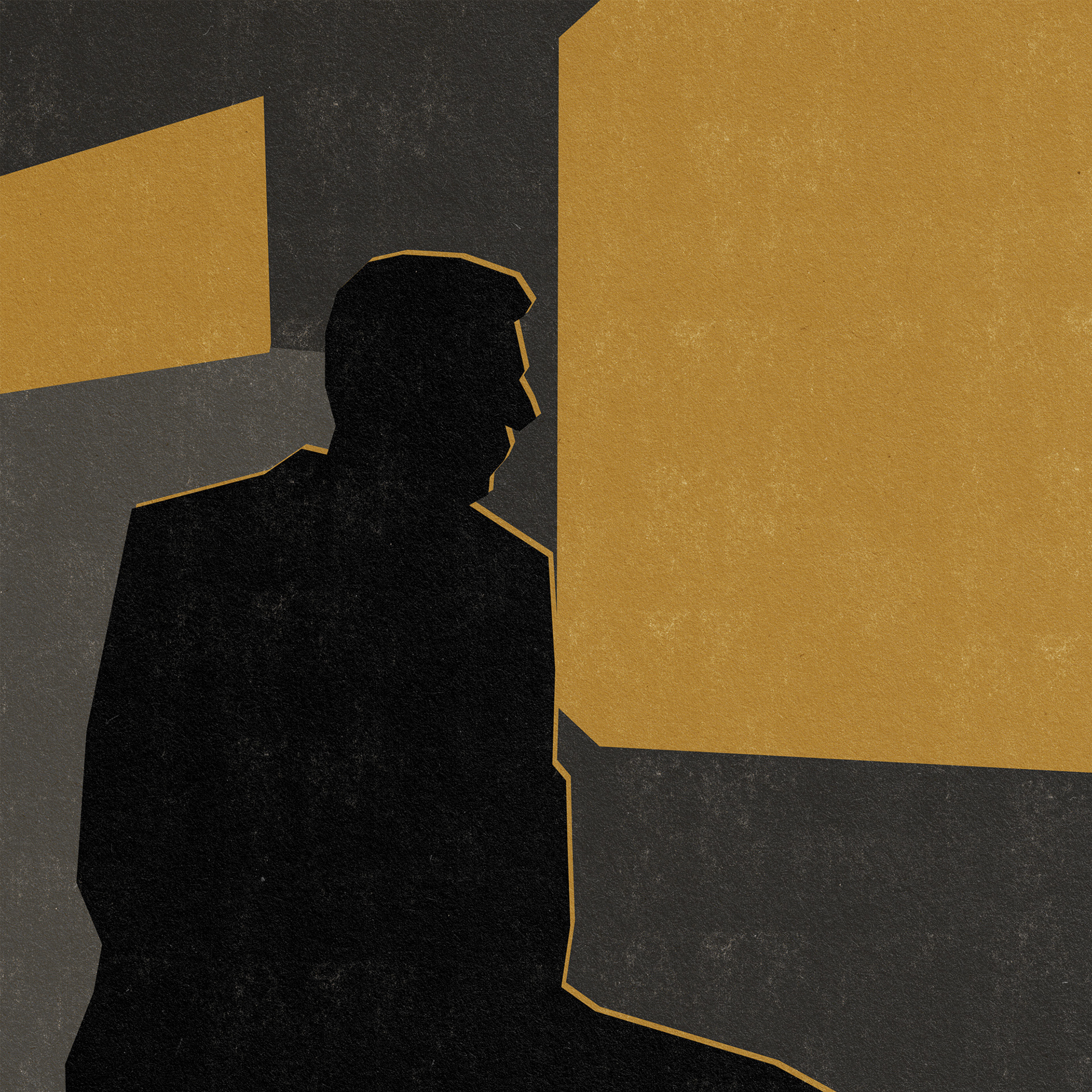
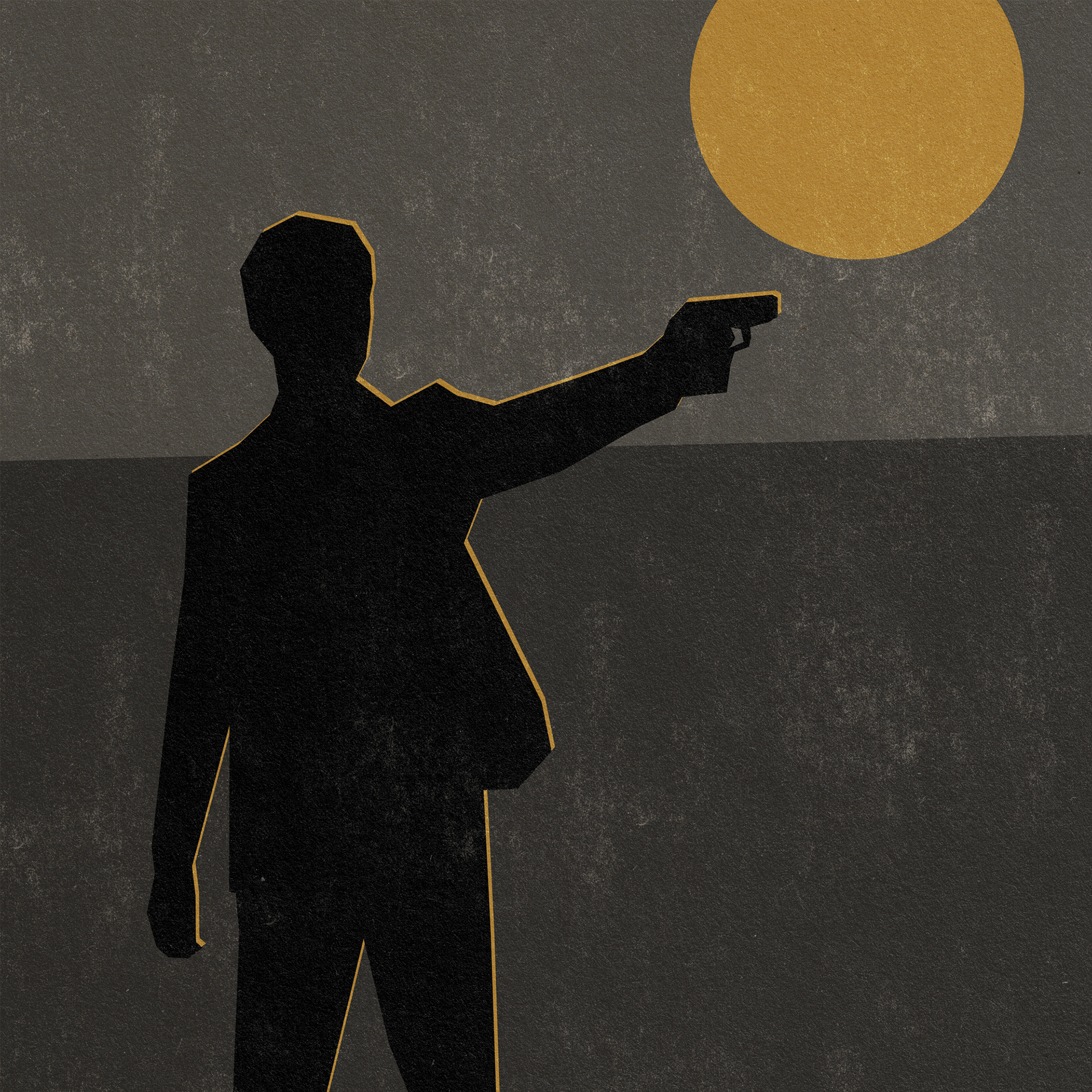
MIA WAYLAND
EMPLOYMENT
STOP SIGNS
EMPLOYMENT
STOP SIGNS